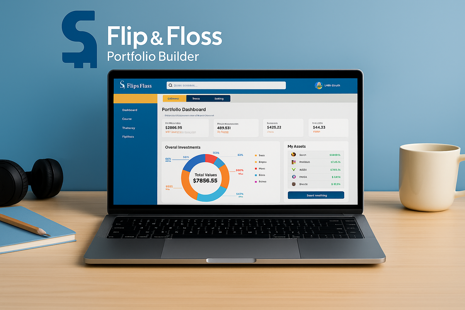
A teen friendly investment tool designed to teach financial confidence through simple visuals and hands on learning.
Year
Fall 2025
Client
Andre Smith
Project Highlights
Project: Flip & Floss – Portfolio Builder
Context: Industry Design Project (IDP) with Flip & Floss, a teen financial literacy startup
Timeline: Fall 2025 (10 weeks)
Team: 4 UX designers
My Role: Research, journey mapping, wireframes, usability testing, presentation
Tools: Figma, Miro, Zoom
OVERVIEW
Flip & Floss is a financial literacy platform that helps kids and teens learn about money through challenges, classroom activities, and hands on tools.
For this Industry Design Project, our team was asked to design a new Portfolio Builder feature for highschool students. The goal was to help teens understand investing, diversification, and risk in a way that feels clear, visual, and beginner friendly.
Through research, ideation, prototyping, and usability testing, we created an experience where teens can build a simple portfolio, explore stocks and bonds, track performance, and learn by doing without feeling overwhelmed like they would in an adult trading app.
The final concept supports confidence, autonomy, and motivation, while fitting naturally into Flip & Floss’s existing gamified learning environment.
Team Collaboration
This project was completed with a team of four UX designers. We worked together on research, shared insights, critiqued wireframes and UI, and aligned our decisions with Flip & Floss stakeholders throughout the process.
PROBLEM
Teenagers are curious about investing, but the tools available to them are built for adults. Most trading apps are packed with charts, jargon, and complex features that make young users feel overwhelmed and unsure where to start.
Flip & Floss needed a Portfolio Builder that gives teens a safe, simple way to practice investing concepts like risk, diversification, and performance without the confusion or pressure of real money platforms.
DESIGN GOALS
We defined three key goals for the Portfolio Builder feature:
1. Make investing visual and intuitive
Help teens understand allocation, growth, and risk through simple charts, clean labels, and minimal cognitive load.
2. Balance fun with professionalism
Older students want something that feels real, not childish. The design needed to stay engaging while
still looking like a tool serious investors would use.
3. Support self directed learning
Design the flow so teens get gentle guidance when they need it, but enough freedom to explore, make decisions, and see their progress inside a safe simulation.
USER RESEARCH
Getting to know the users
Before designing the portfolio builder, we wanted to understand how kids actually think about money and investing. Do they even find it interesting? What motivates them to invest?
To answer these questions, we talked to three groups of students,
• Upper Elementary (10 - 11 years)
• Middle School (12 - 14 years)
• High School (15 - 17 years)
We also analyzed a classroom recording of students using Flip Academy in New York City to see their real behaviors and motivations.
Design Process
To understand how kids engage with money, we spoke with 5-7 students aged 10-17 who were curious about saving and investing. Each conversation was a window into how they think, what excites them, and what holds them back. Through these semi structured virtual sessions, I explored their motivations, challenges, and expectations, uncovering what makes financial learning fun, clear, and rewarding for them.
Focus Area
Learning methods
Motivation to track progress
Challenges with current tools
Rewards & gamification
Parent involvement
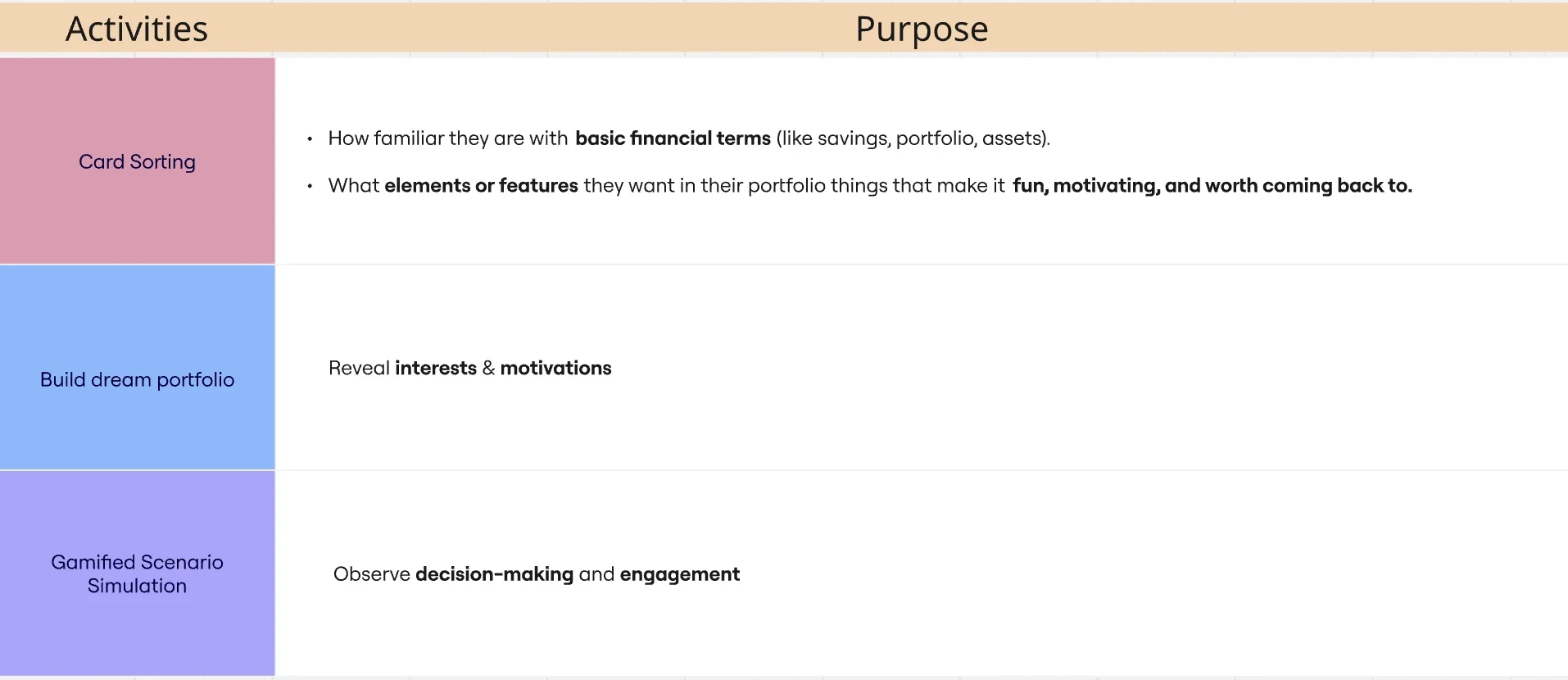
Certain interactive activities were conducted to uncover the motivations, interests, and engagement drivers of kids while learning about investments.
Card Sorting
Conducted first to familiarize participants with portfolio elements.
Revealed which terms or visuals were easiest for them to understand.
Provided a foundation for later activities like gamified scenarios and portfolio building.
Informed the information architecture and labeling of the portfolio section.
voices of our young investors
“I like seeing my progress. The charts help me understand what’s going on.”
“I don’t want it to look like a little kid app. I want something that feels real.”
“Sometimes the numbers confuse me, so I need simple explanations.”
“I like when it feels like a real economy, not just a game.”
“Make it easy to see if I'm doing good or bad. I want quick feedback.”
“I want to learn, but I don’t want to read a lot. Just show me the important stuff.”
“I like seeing my progress. The charts help me understand what’s going on.” “I don’t want it to look like a little kid app. I want something that feels real.” “Sometimes the numbers confuse me, so I need simple explanations.” “I like when it feels like a real economy, not just a game.” “Make it easy to see if I'm doing good or bad. I want quick feedback.” “I want to learn, but I don’t want to read a lot. Just show me the important stuff.”
What We Learned
Teens want tools that feel real but not overwhelming.
Younger students respond to visual feedback, not long blocks of text.
Clear explanations and simple labels increase confidence with investing concepts.
Motivation increases when they can connect investing to personal goals.
COMPETITIVE & HEURISTIC ANALYSIS
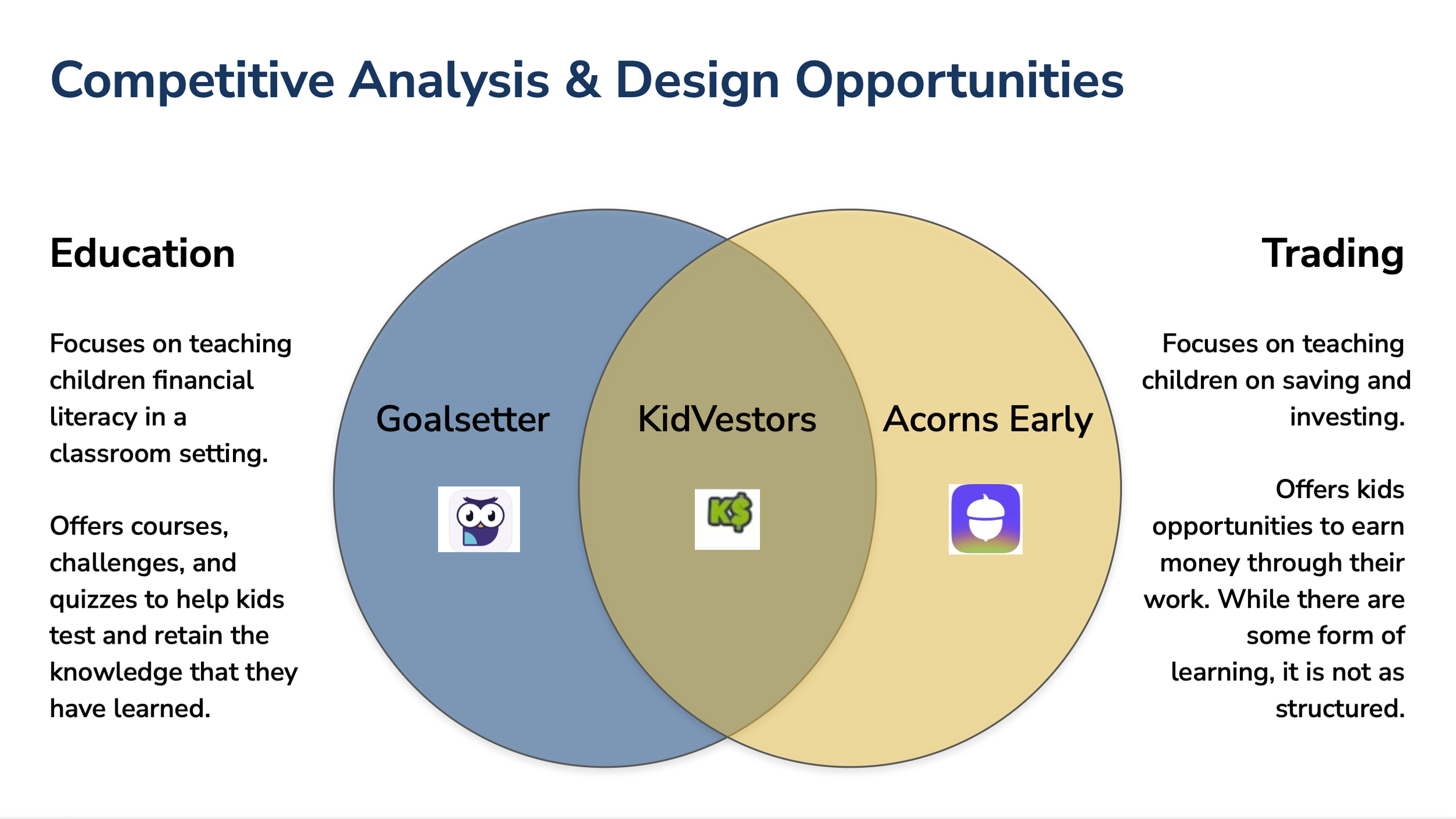
To understand how other financial tools support young learners, we reviewed Goalsetter, KidVestors, and Acorns Early. We also evaluated their usability using Nielsen’s heuristics to see where kids and teens might struggle.
“A comparison of how our top three competitors approach financial education and youth investing, revealing gaps that guided our design direction.”
What We Saw
• Dashboards often show too much information at once.
• Heavy jargon and dense text make investing feel confusing.
• Most tools lack clear guidance for first time users.
• Teens have limited autonomy in many kid focused apps.
What This Means for Flip & Floss
• Keep language simple and direct without being childish.
• Use clear visuals instead of complex charts.
• Add small, in context explanations that support learning.
• Let teens safely explore and learn by doing.
Meet Our Users
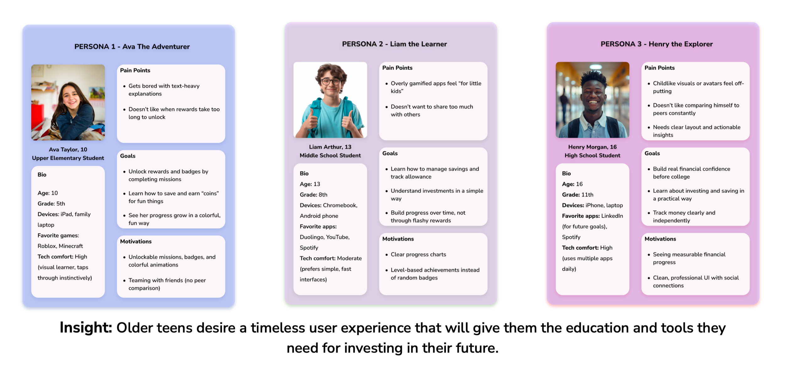
Based on the interview insights, I identified recurring themes and behavioral patterns that shaped the creation of my user personas. These patterns revealed teens’ motivations, challenges, and expectations around money management, helping me design personas that accurately represent the target audience and guide key decisions for the Portfolio Builder.
Designing for the Right Audience
Through our research and persona development, it became clear that different age groups had very different needs and expectations. we presented this insight to the client and recommended narrowing the target audience so we could design a more focused and meaningful experience.
This alignment helped our team prioritize effectively and create a solution that truly supports the users who would benefit the most.
DEFINING THE SOLUTION
Based on our research, stakeholder goals, and early concept exploration, we focused on building the Investor Path for the Flip & Floss Portfolio Builder. This path gives teens a simple, safe way to practice investing concepts without the pressure of real money.
MVP Focus
We defined a clear MVP that balances clarity, autonomy, and educational value:
Build and view a simplified stock and bond portfolio
Show performance and progress in a visual, teen friendly way
Keep language approachable and avoid financial jargon
Provide small hints and explanations when needed
Support decision making with clear, minimal screens
Why This Approach
This scope allowed us to:
Teach essential investing concepts without overwhelming students
Design a clean, focused experience for older teens
Fit naturally into Flip & Floss’s classroom-based learning environment
Prioritize features that drive confidence and long-term understanding
INFORMATION ARCHITECTURE
&
USER FLOWS
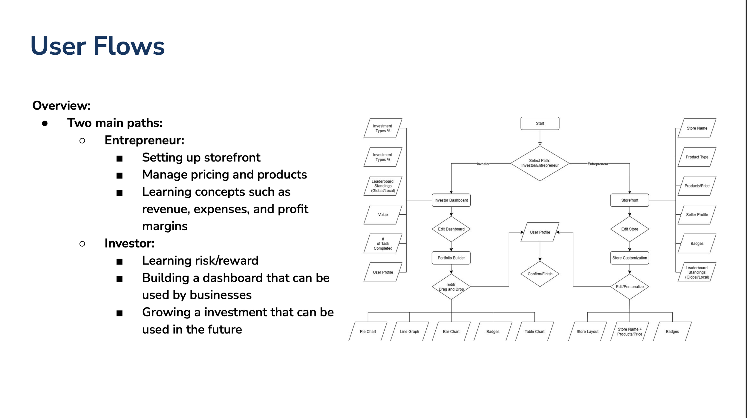
As we moved from research into defining the structure of the product, we explored two possible learning paths: Entrepreneur and Investor. Each path required different interactions, levels of complexity, and learning outcomes. To understand the user experience end to end, I designed the complete user flow and wireframes for the Entrepreneur concept, while our team explored the Investor path in parallel.
“Initial Entrepreneur user flow created during early exploration. This path was later scoped for a future phase after research revealed its complexity for younger users.”
Early Exploration: Entrepreneur Path
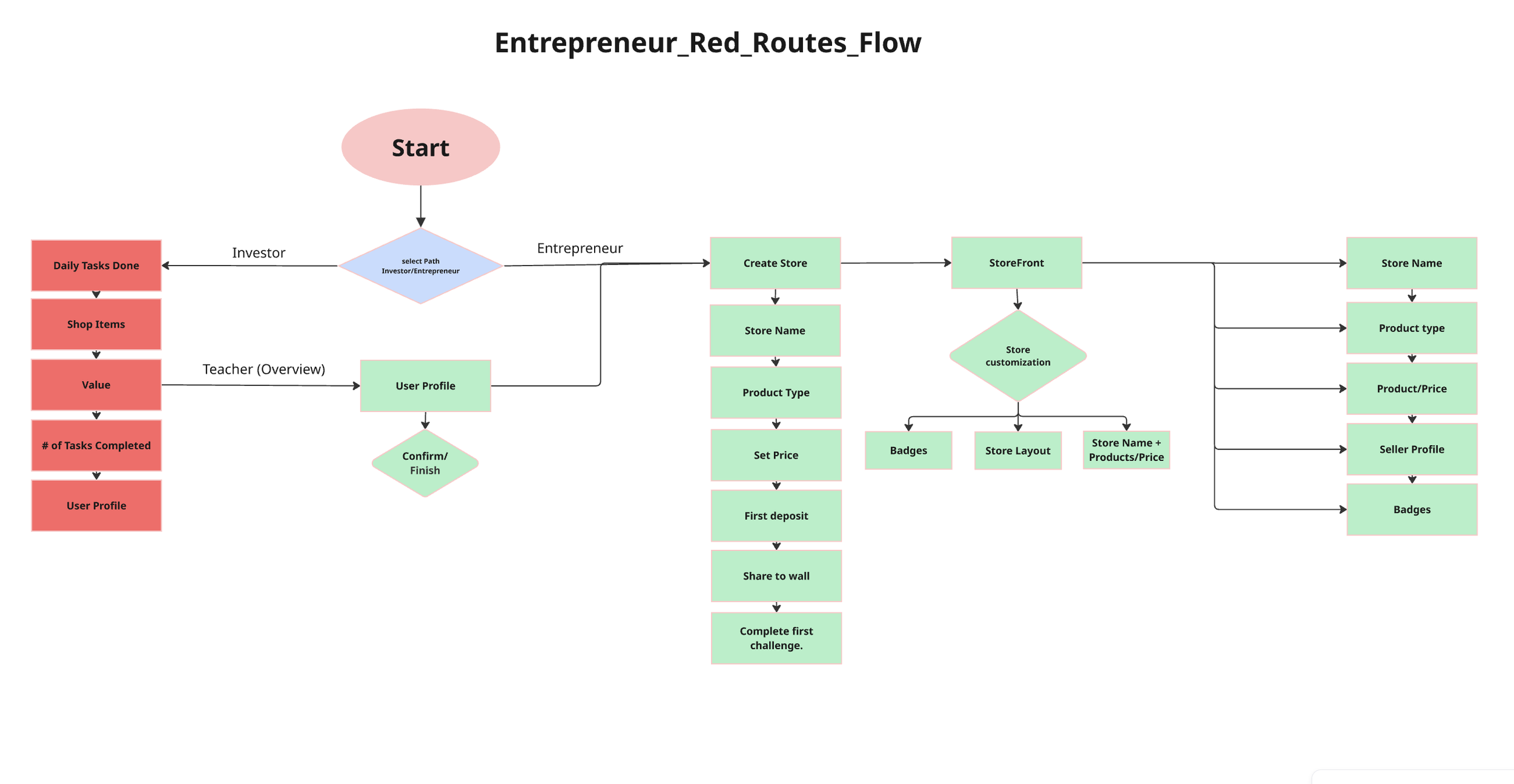
I created the full user flow and low fidelity wireframes for the Entrepreneur path. This concept included storefront creation, pricing, revenue modeling, customization, and completing challenges. The goal was to help students learn business fundamentals in a hands on way.
“Initial Entrepreneur flow created during early exploration. Designed by me as part of scoping and concept development.”
Entrepreneur Wireframes
I started these screens as hand sketches and then digitized them to present the flow in a clear and organized way.
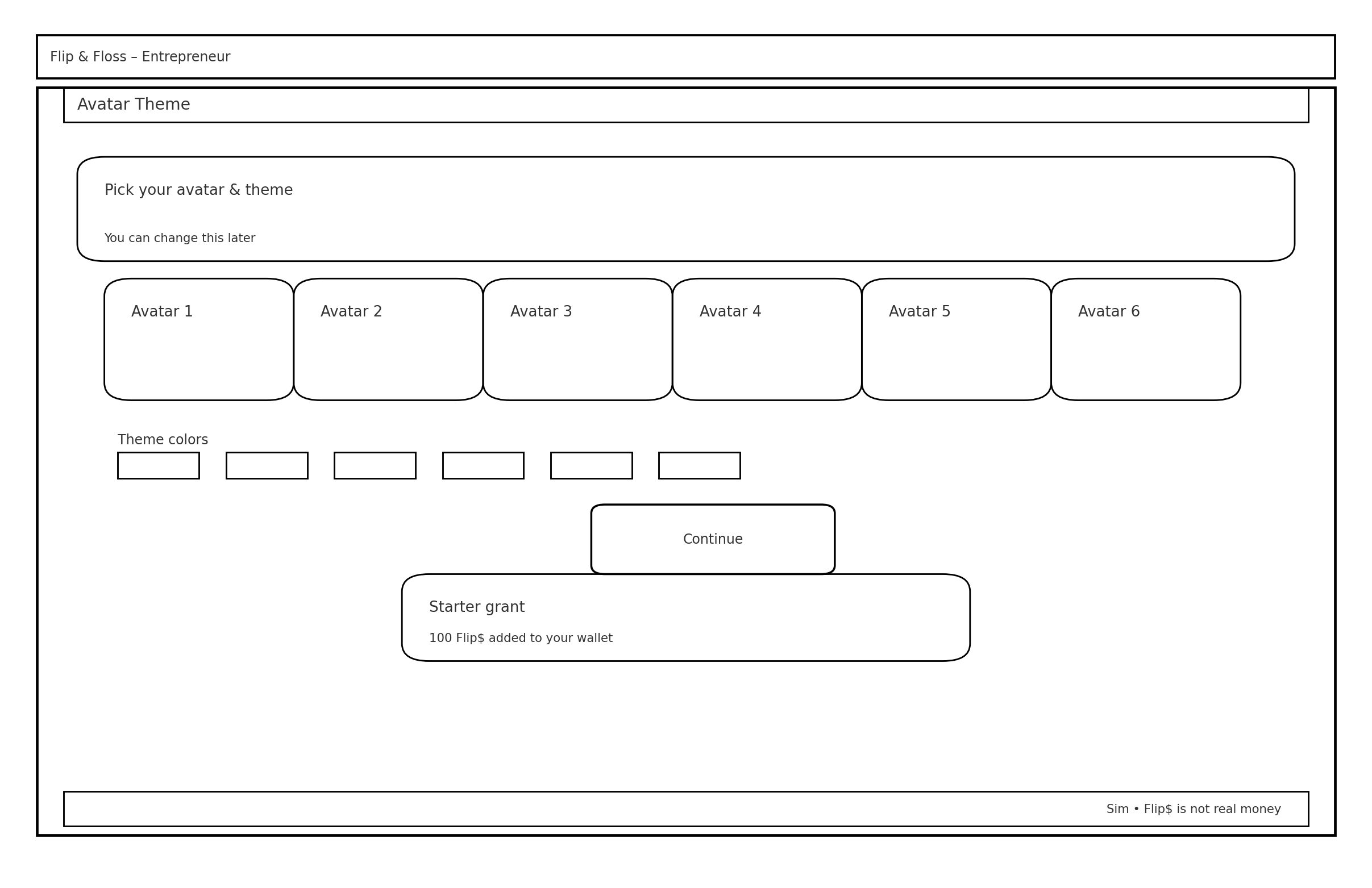
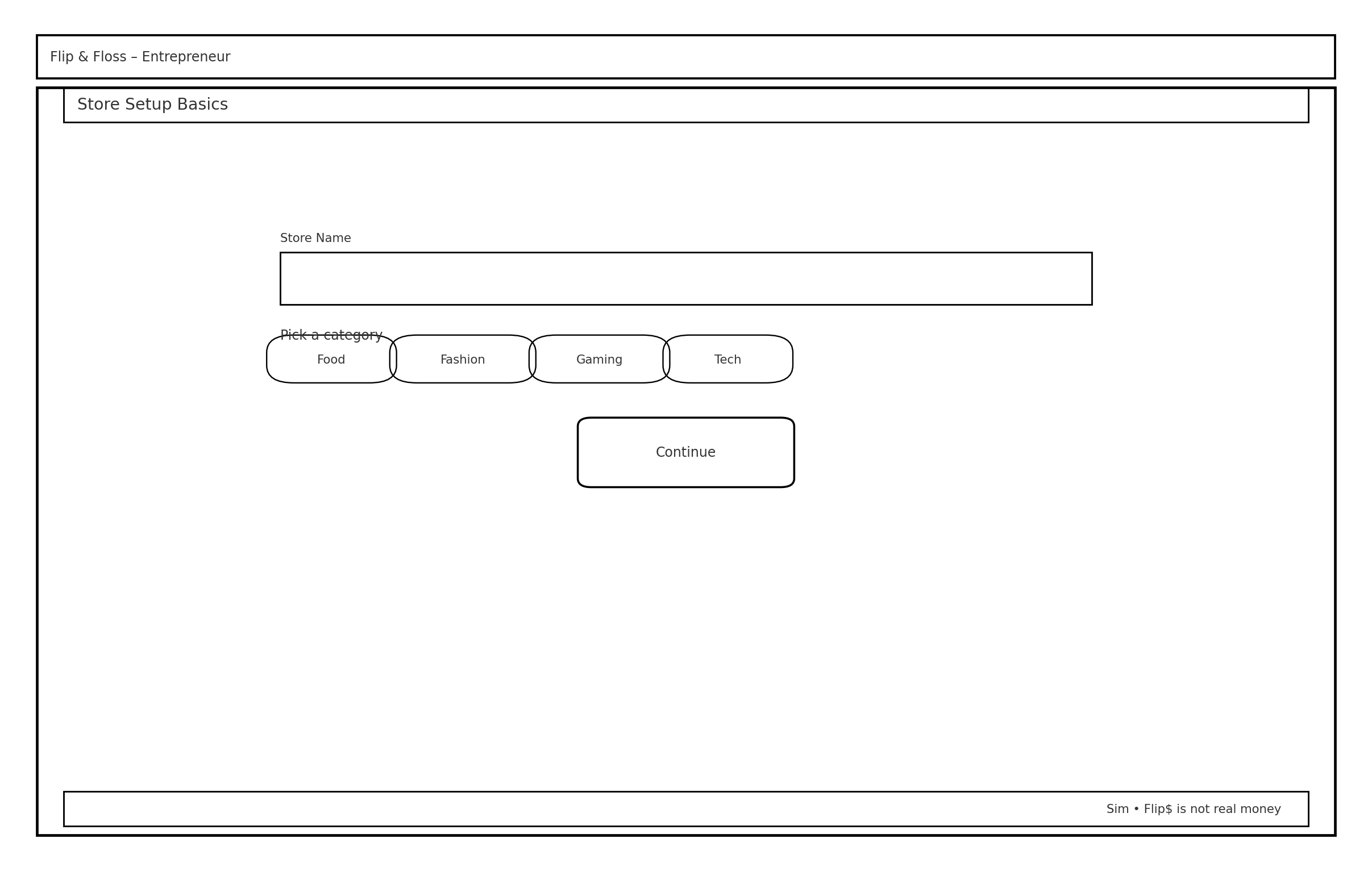
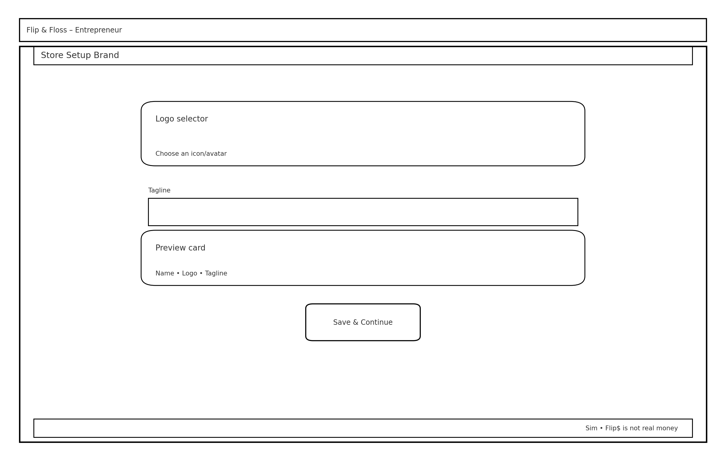
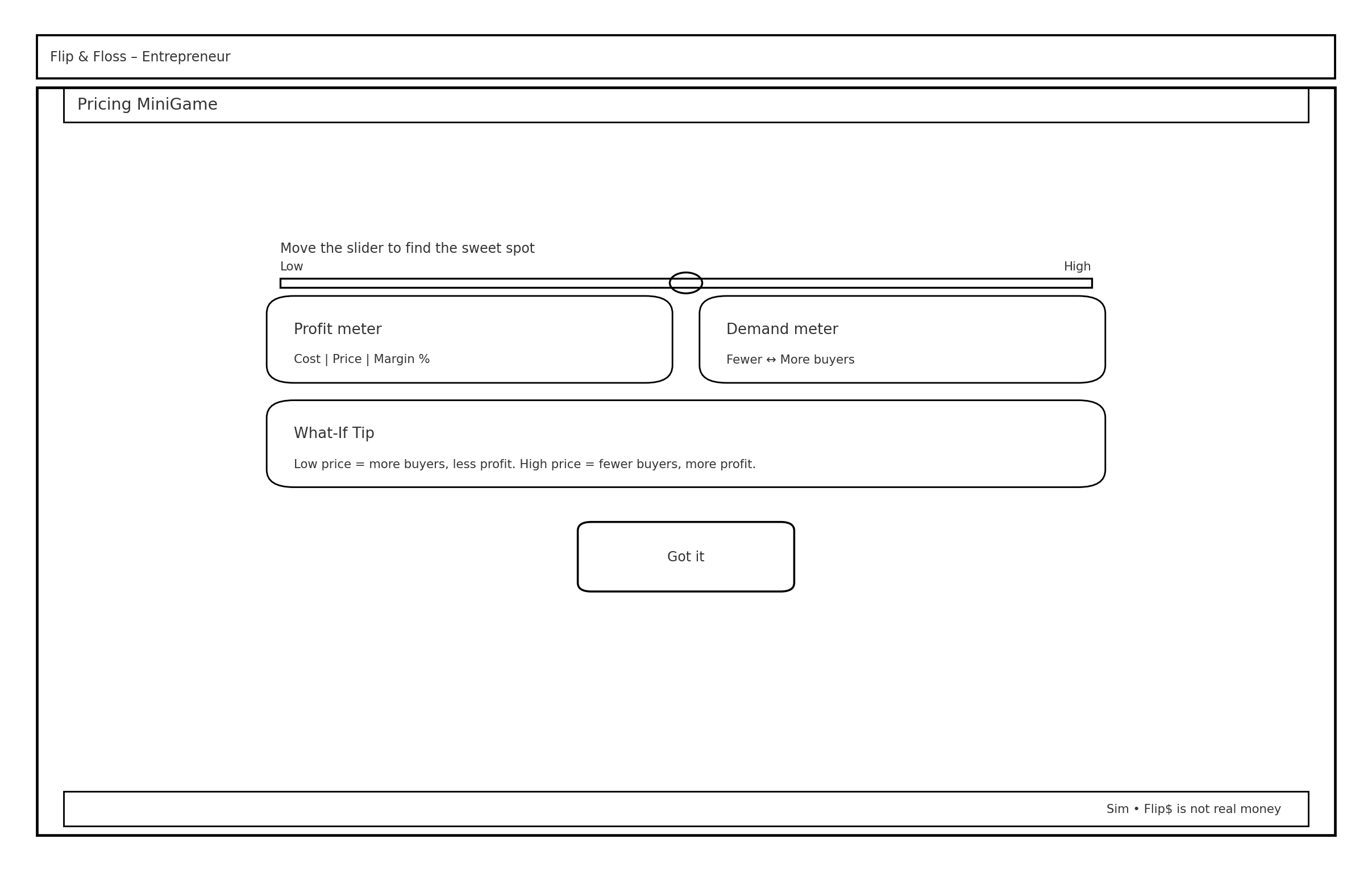
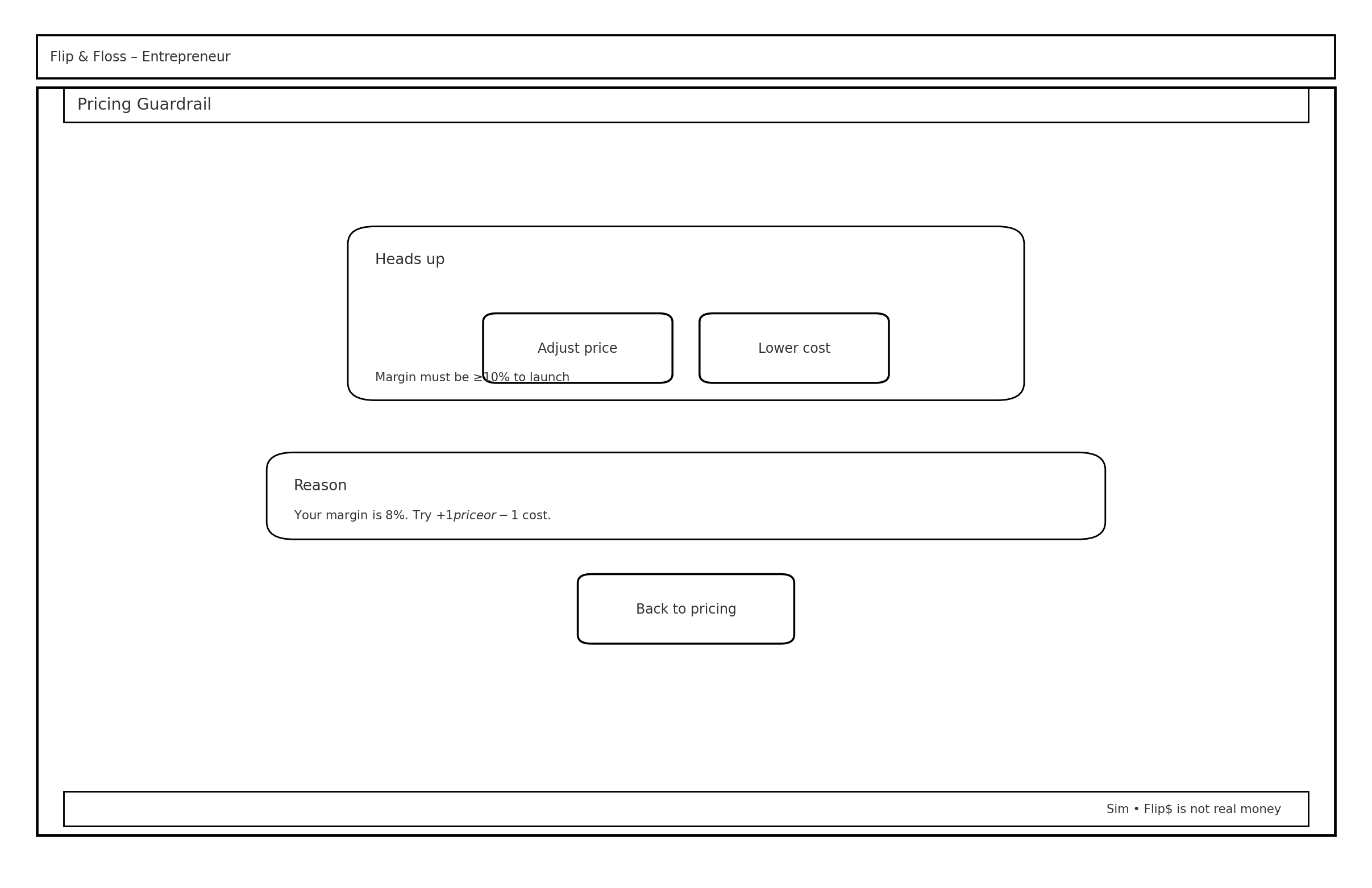
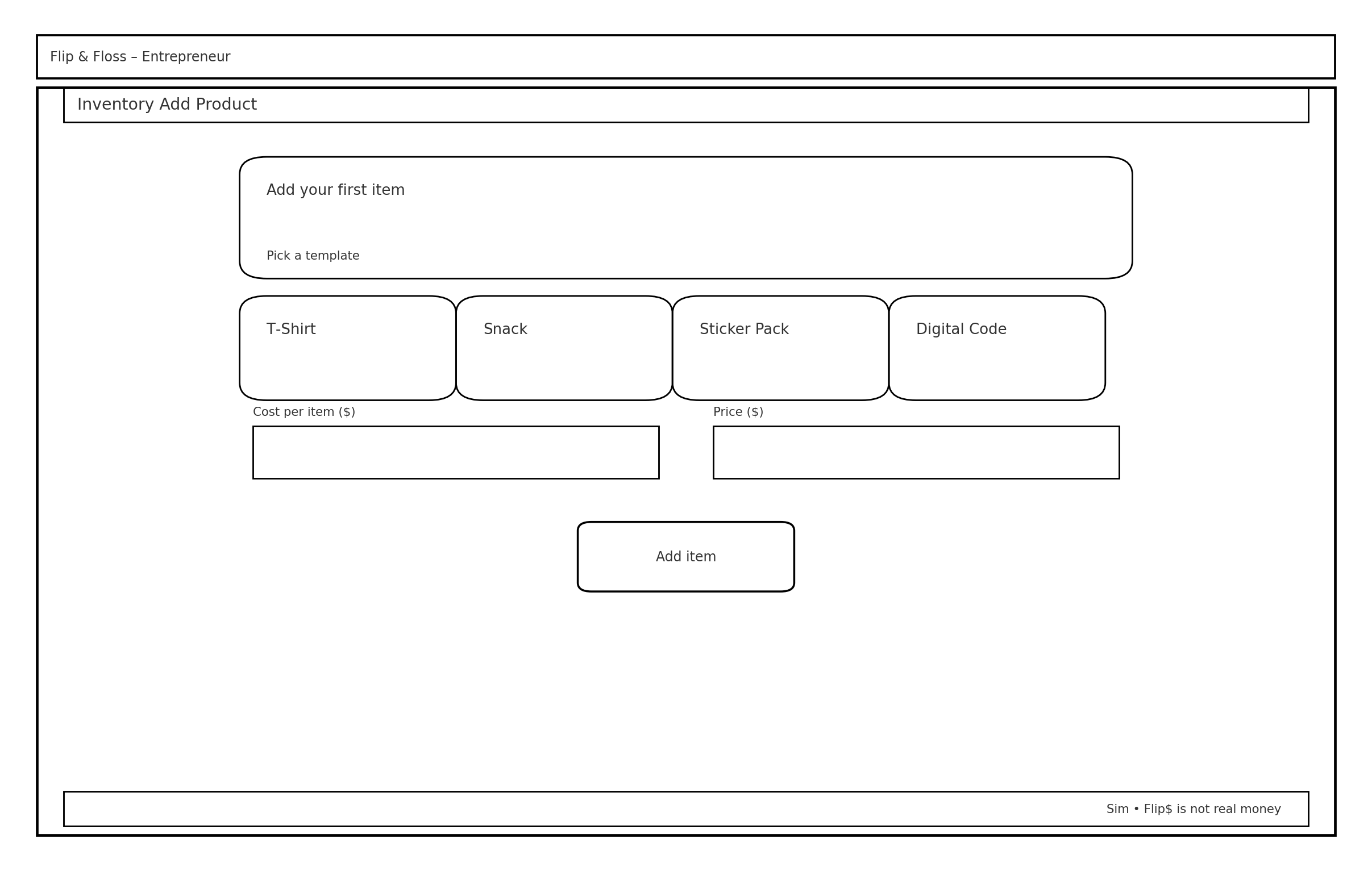
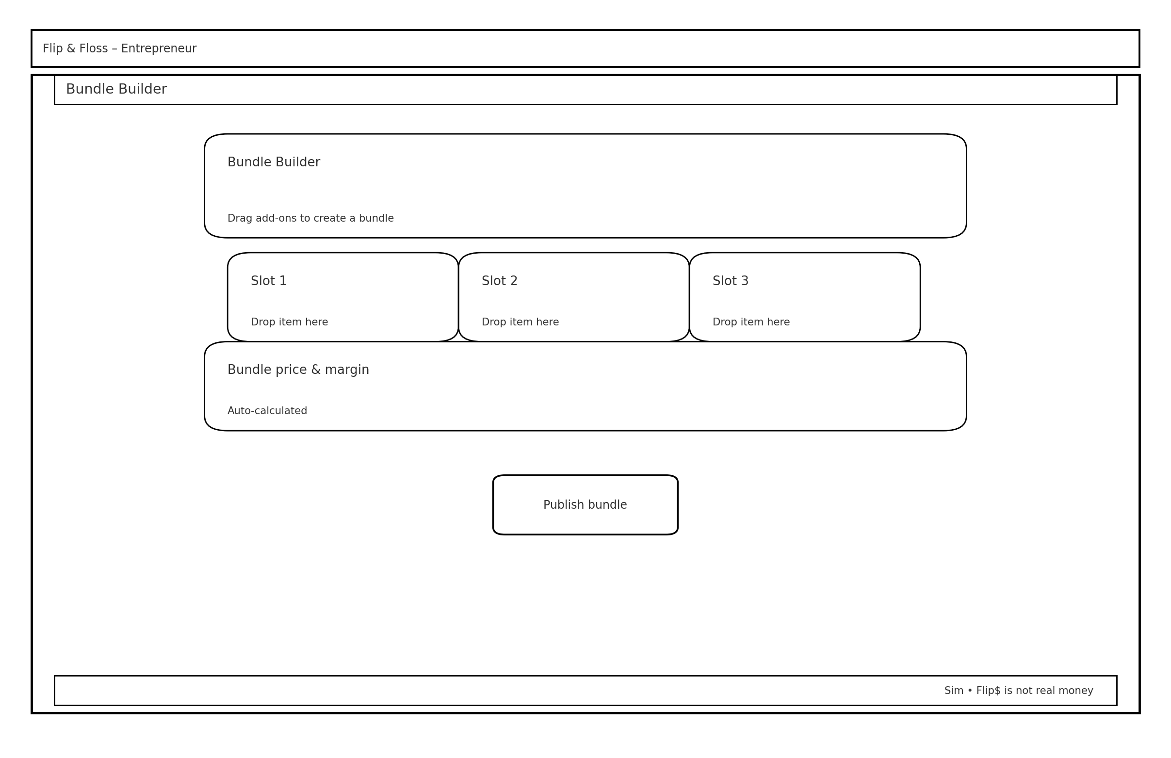
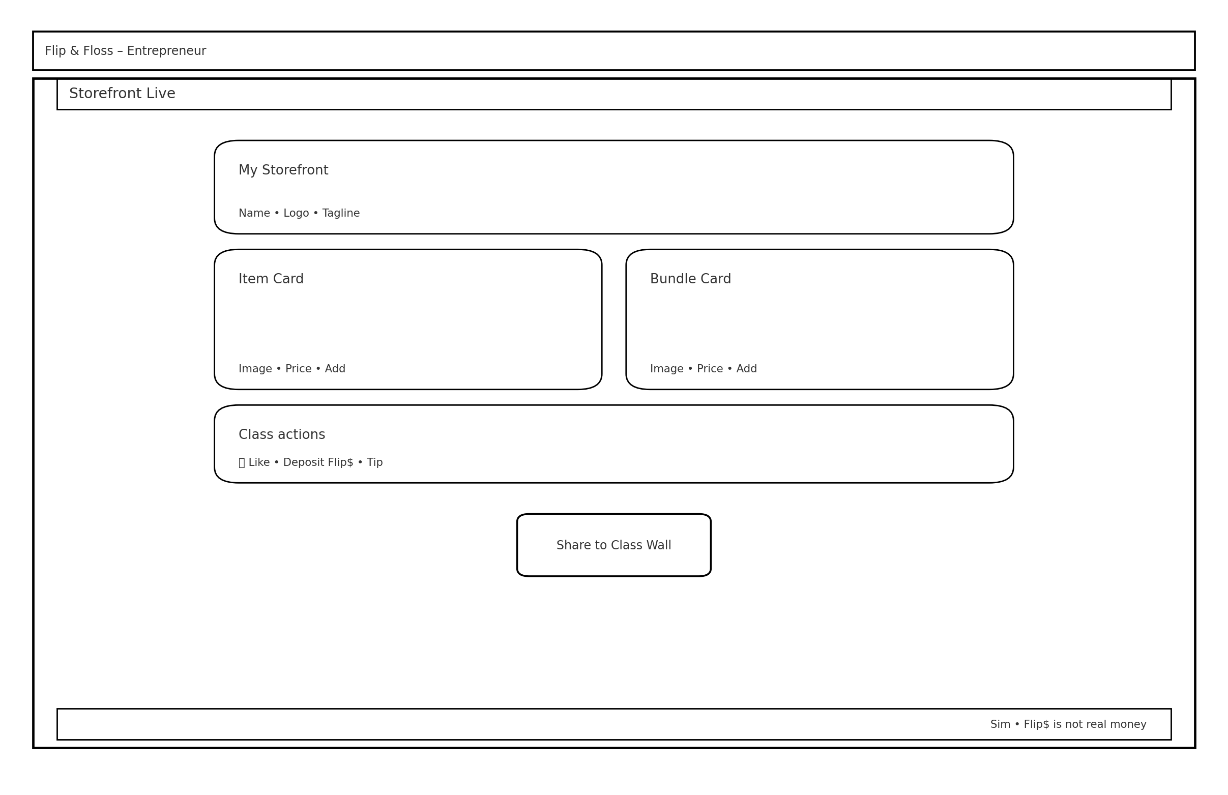
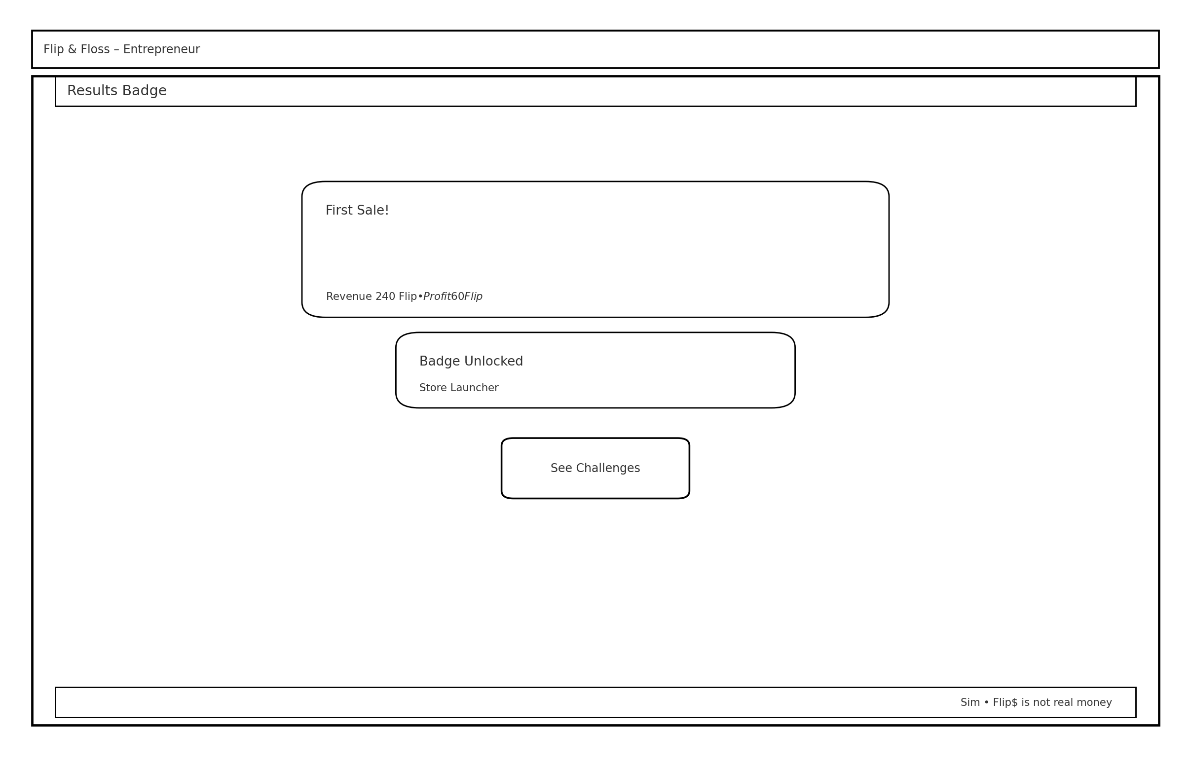
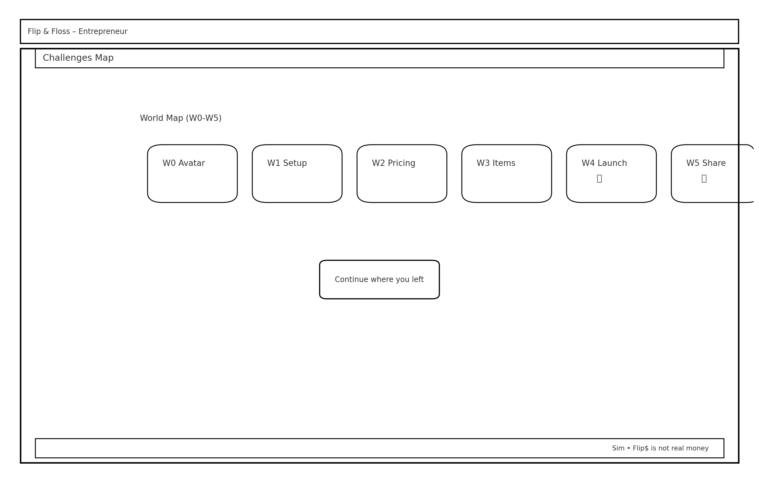
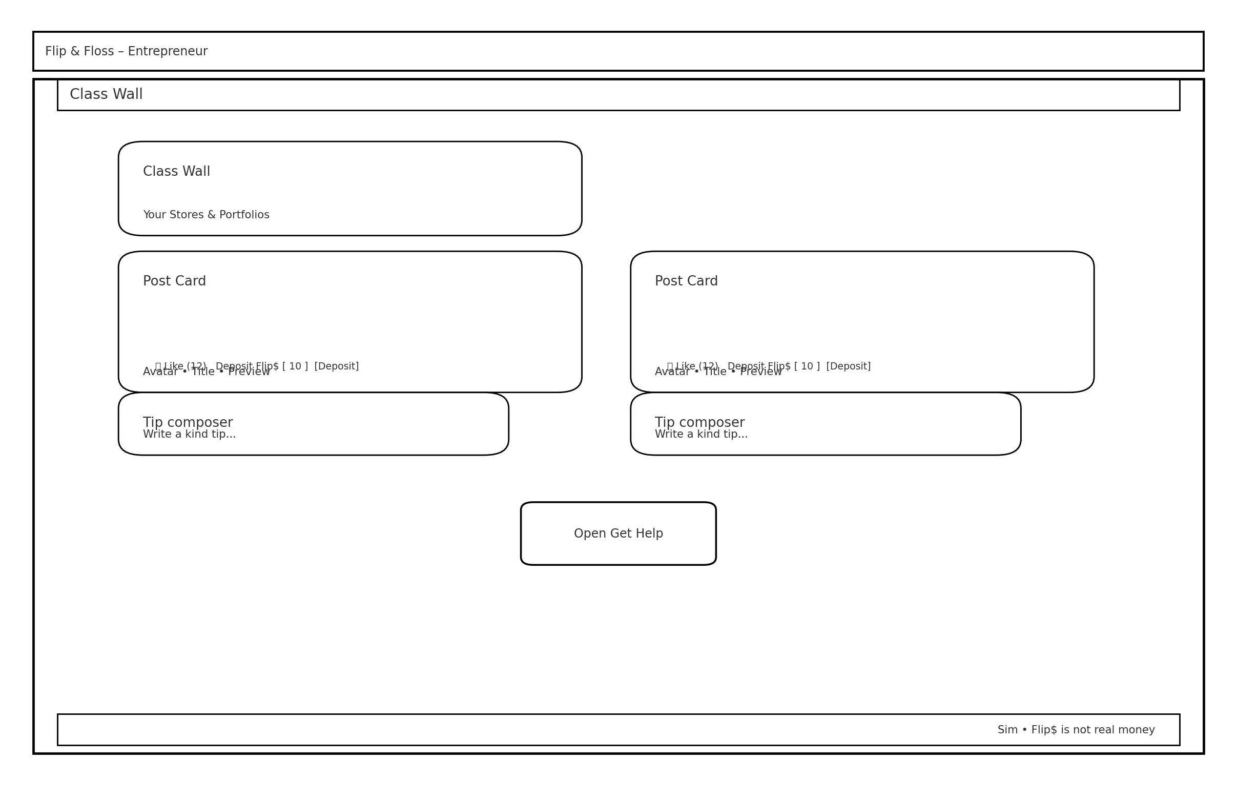
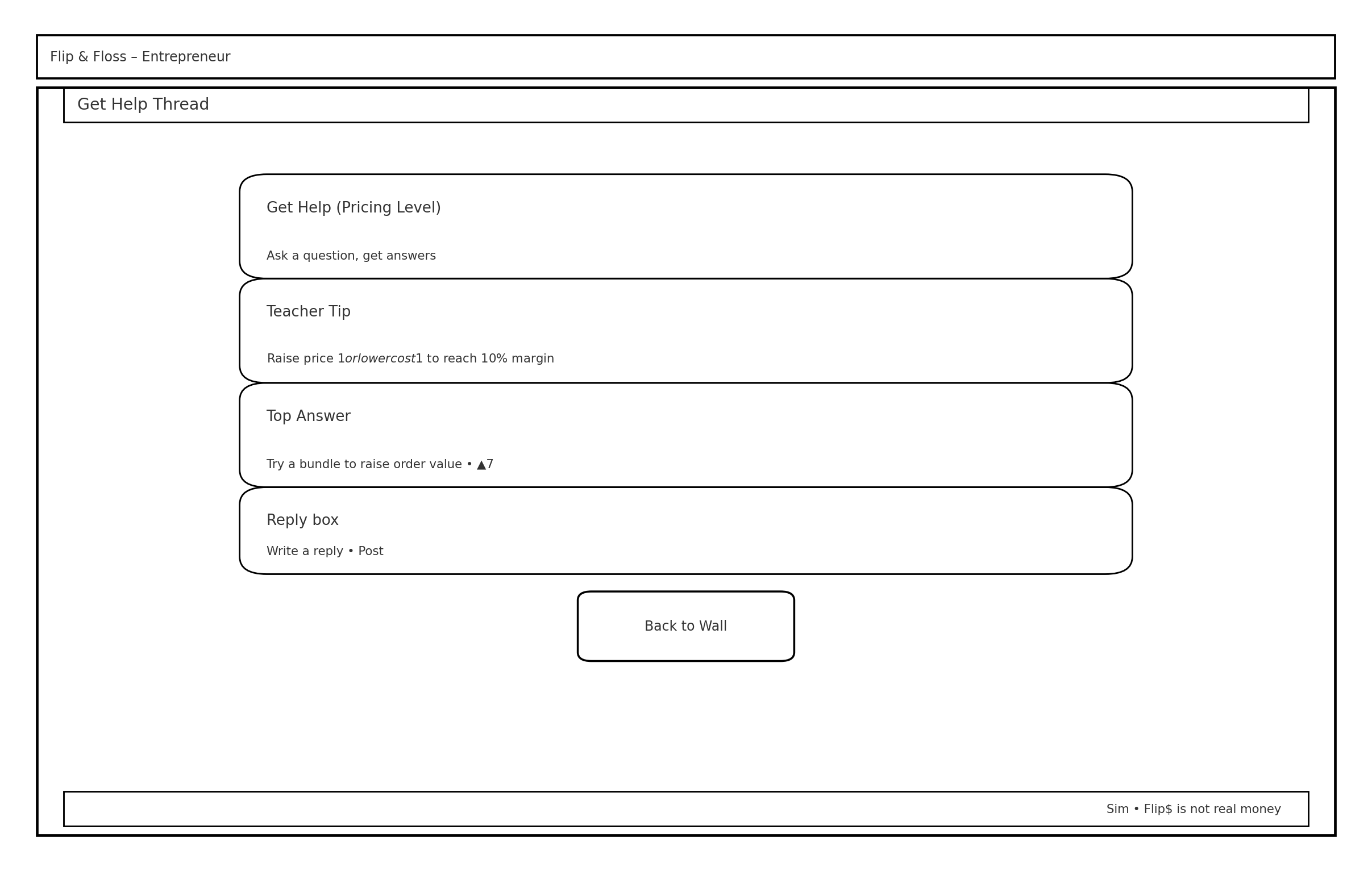
“These wireframes represent the full experience I designed for the Entrepreneur path, including storefront setup, product pricing, customization, and progression challenges.”
Choosing the Right Path for the MVP
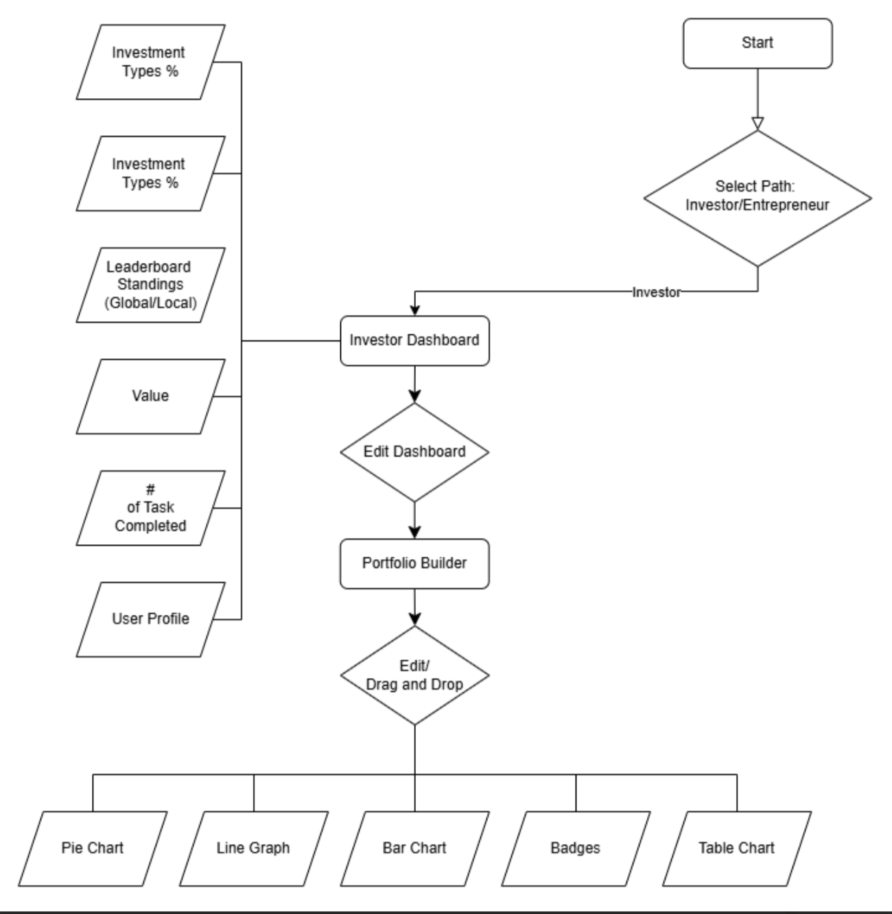
We chose to focus on the Investor path because research and client feedback showed it was more age appropriate and realistic for our timeline than the more complex Entrepreneur path. Even though the Entrepreneur path was de scoped from the MVP, this work was still valuable. It helped us understand the full product vision, compare complexity between the two paths, and confidently recommend focusing the first release on the Investor experience. while my teammates led the high fidelity wireframes and prototyping for this flow, I contributed to structuring the information architecture, refining the dashboard tasks, and ensuring the design stayed rooted in our research insights.
“Final user flow for the Investor path, designed as the core experience for the MVP after narrowing scope based on research and client alignment.”
Investor Wireframes
These wireframes were developed collaboratively by our team as part of the final MVP direction. My role involved refining IA, contributing usability recommendations, and ensuring alignment with the user needs we identified during research.
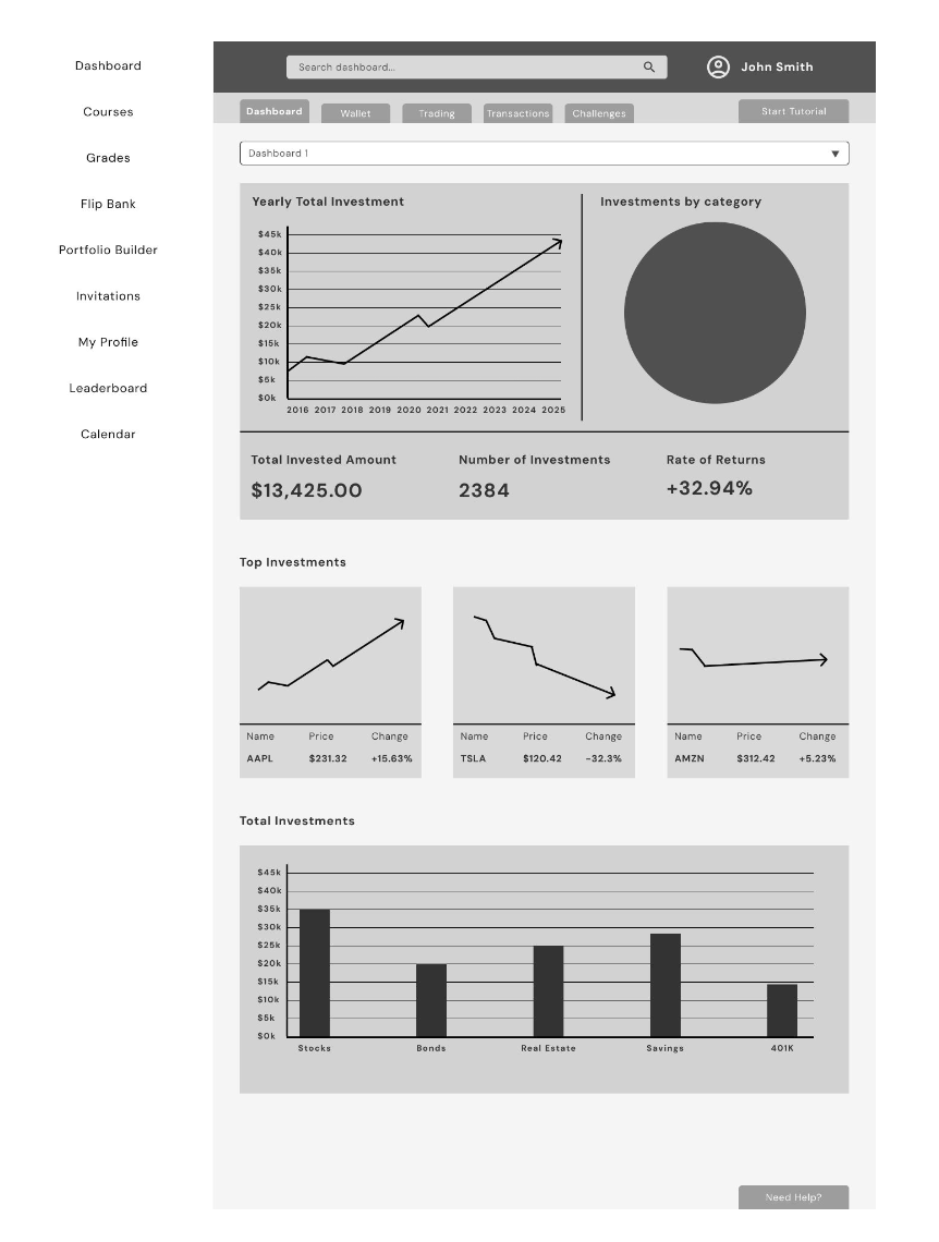
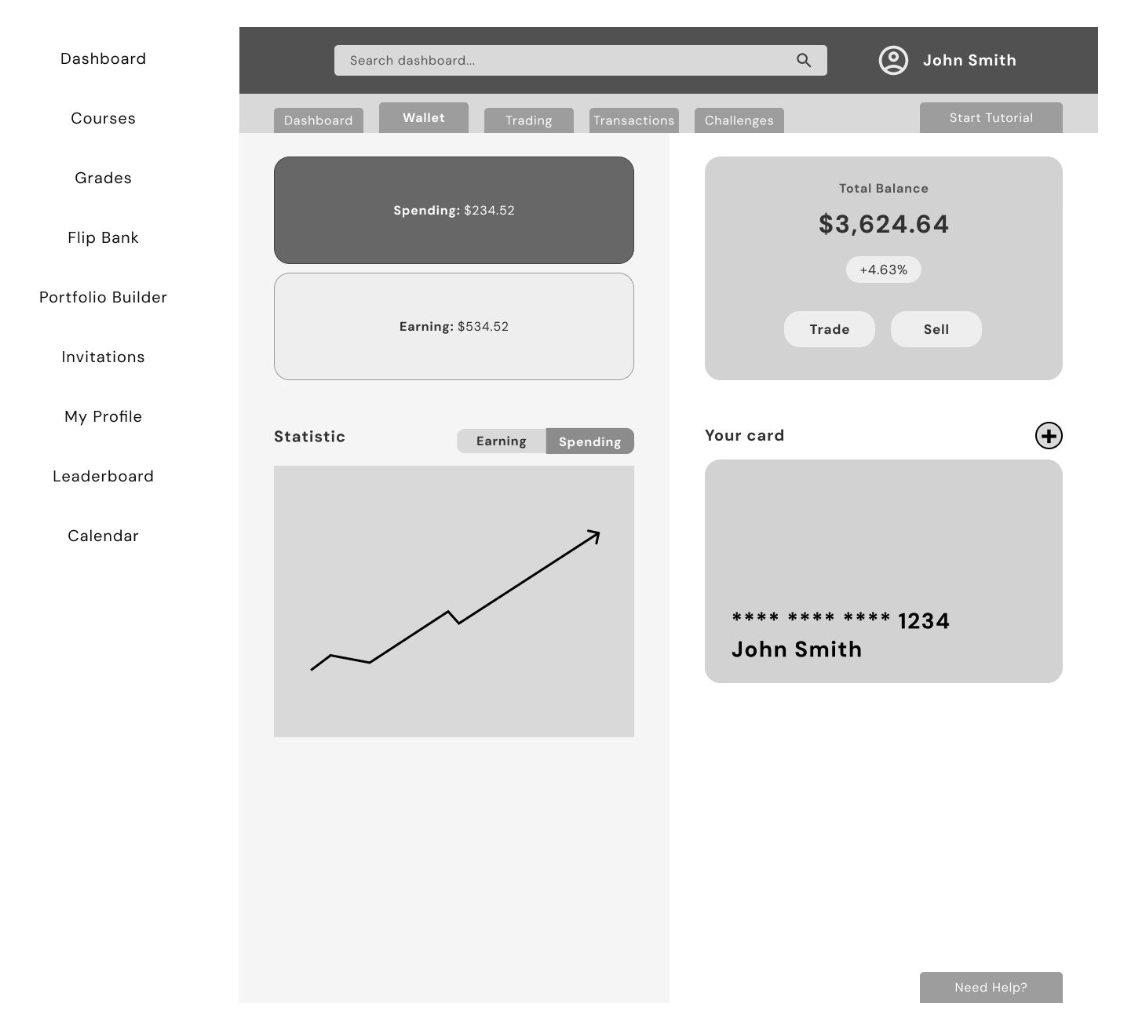
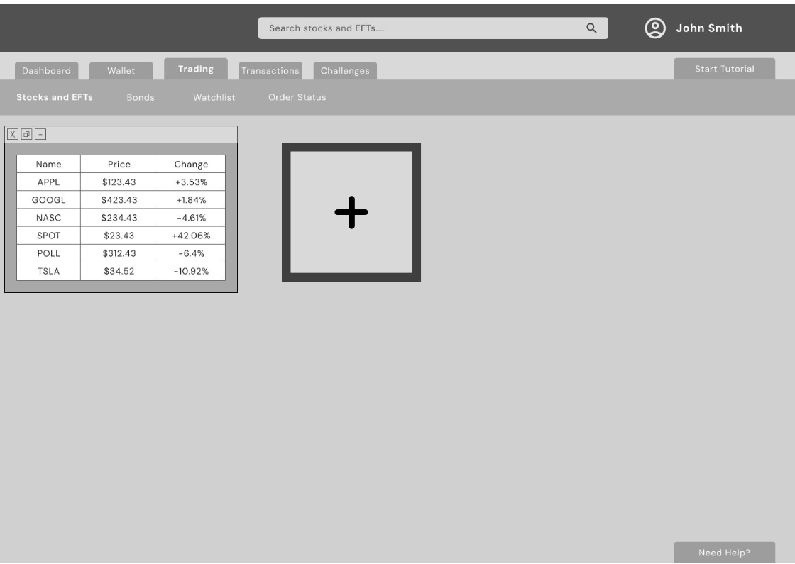
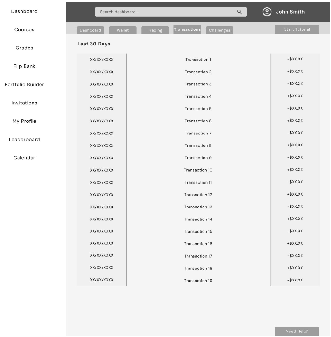
These wireframes helped us see the full experience before moving into high fidelity and the prototype. They made it easier for our team to stay on the same page and make smart choices before polishing the final design
HIGH FIDELITY DESIGNS
After completing the user flows and low fidelity wireframes, our team moved into creating the high fidelity designs and interactive prototype for the Investor path. These designs became the foundation for our usability testing sessions.
My Contributions
• Ensured the UI reflected user needs and avoided unnecessary complexity
• Recommended improvements to hierarchy, labeling, and information clarity
• Helped refine dashboard content and prioritization based on teen behavior
• Participated in critiques and UX reviews throughout the design phase
• Used the high fidelity prototype to conduct usability testing sessions
• Synthesized user feedback and proposed adjustments for the next iteration
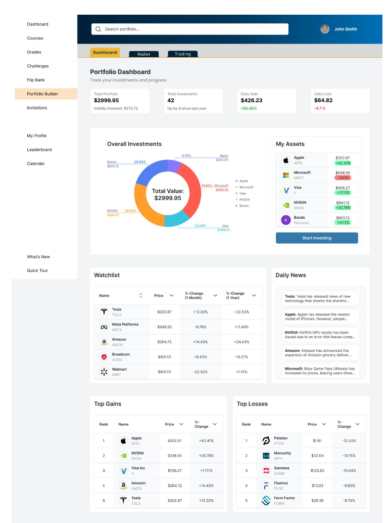
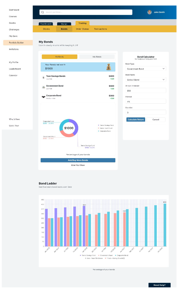
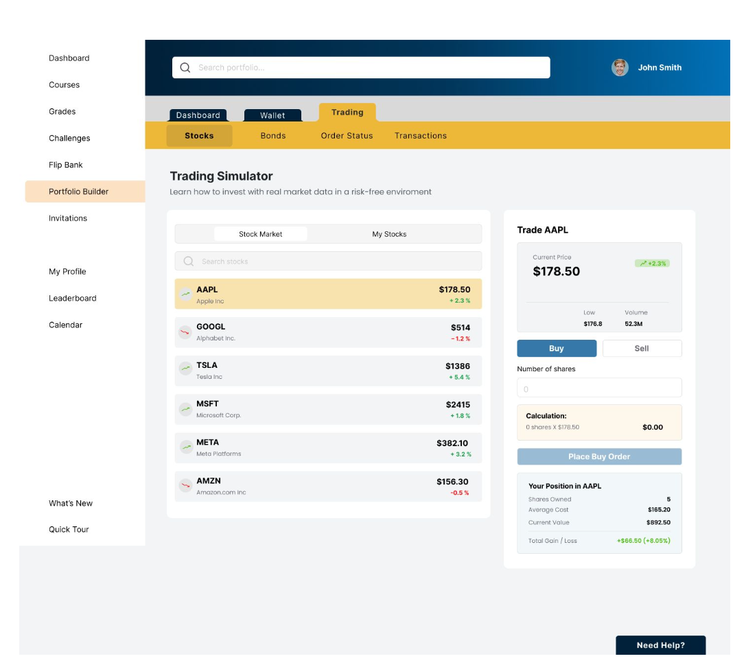
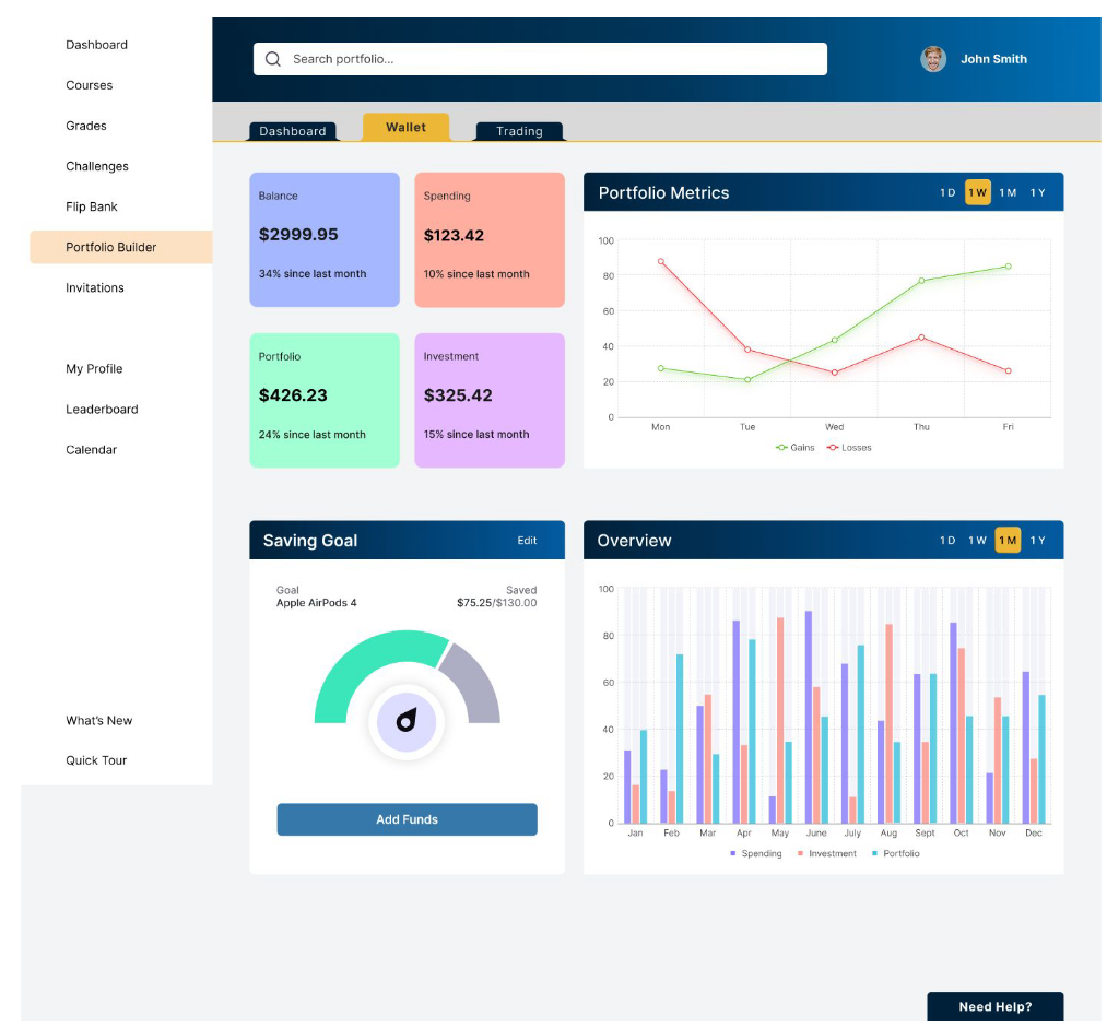
Final Investor UI Designs
These high fidelity screens were designed collaboratively by the team and represent the final MVP direction for the Investor path.
“These high fidelity screens were designed collaboratively by the team and represent the final MVP direction for the Investor path.”
Interactive Prototype
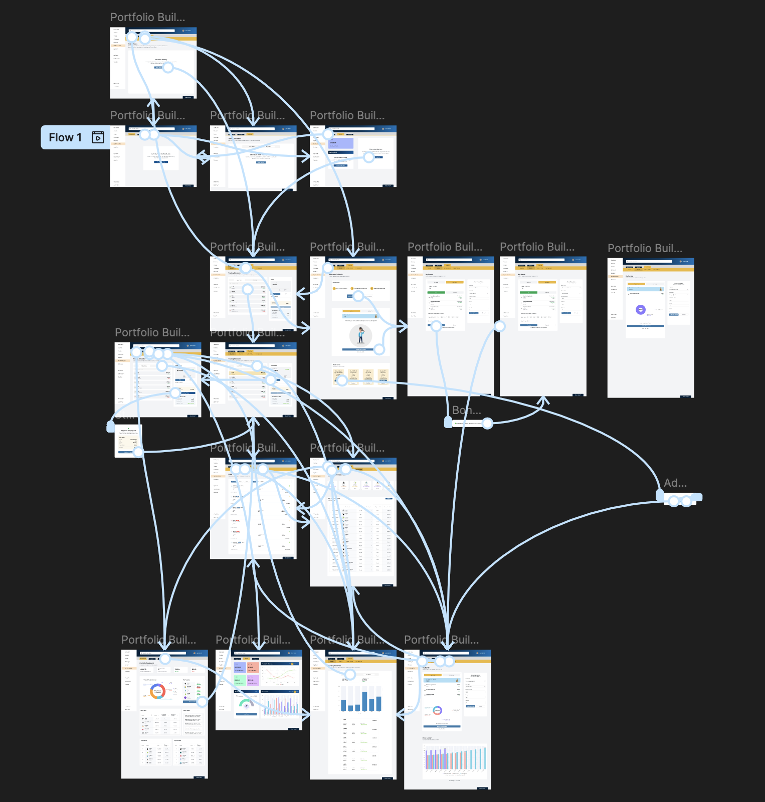
Once the high fidelity screens were completed, our team built an interactive Figma prototype for the Investor path. This prototype connected the core flows Dashboard, Trading, Portfolio Builder, and Transactions and allowed us to evaluate how teens navigate the experience end to end.
“Prototype created collaboratively by the design team.
Used for usability testing and validation.”
USABILITY TESTING
Once the high fidelity prototype was completed, I conducted moderated usability testing sessions with teen users. The goal was to evaluate how intuitive the Investor path felt, how clearly information was communicated, and where students needed additional guidance or simplification.
Test Setup
• Method: Moderated sessions (in person and remote)
• Prototype: High fidelity interactive Figma prototype
• Session length: ~25 minutes
• Number of participants: 2
• My role: Facilitator, observer, note taker, and insights synthesizer
I used the prototype to guide participants through key tasks, asked follow up questions to understand their mental model, and documented confusion points and opportunities for improvement.
What We Tested
• Finding and opening the Portfolio Builder
• Buying a stock and adding a bond
• Reading the dashboard graphs and portfolio overview
• Navigating between Dashboard, Wallet, and Transactions
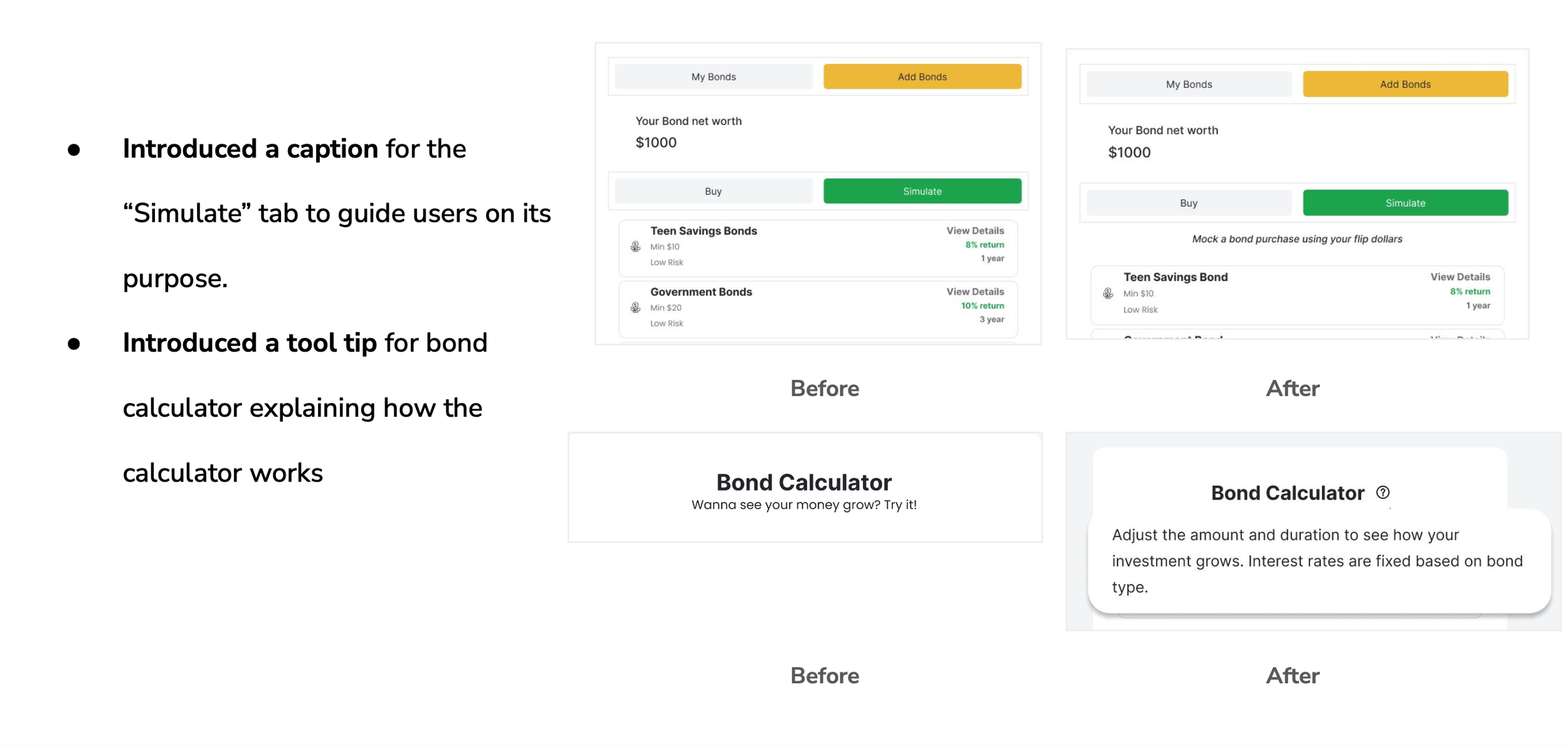
• Understanding basic terms like “simulate” and risk indicators
Key Findings
• Teens liked the overall flow and found the steps easy to follow.
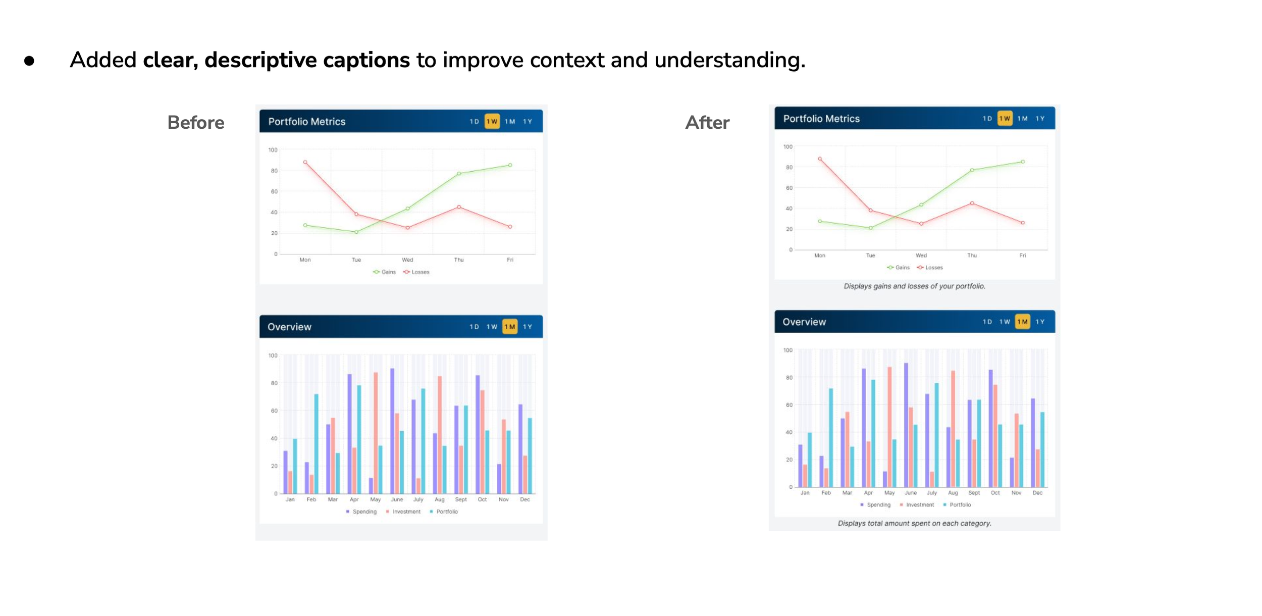
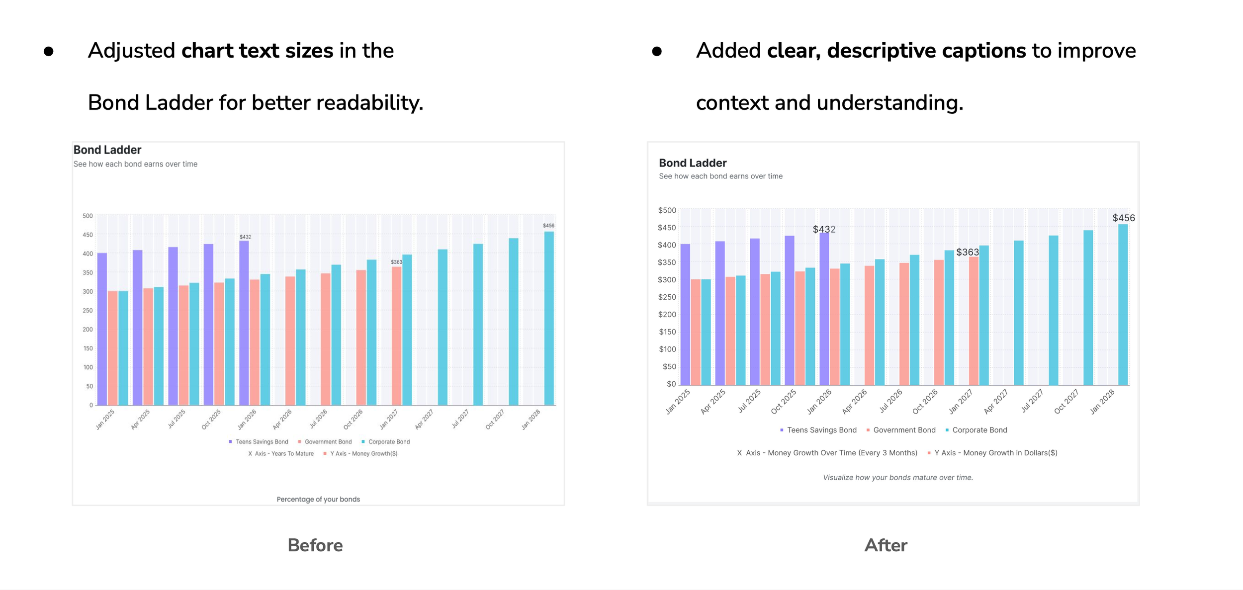
• Graphs were helpful, but some charts and the overview section needed clearer explanations.
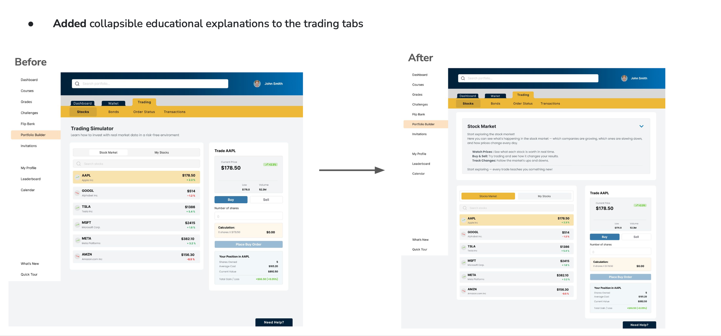
• Some terms and labels felt confusing or too “financial.”
• Text and numbers (especially in charts) were sometimes too small.
• Teens asked for more color, contrast, and a slightly more playful feel.
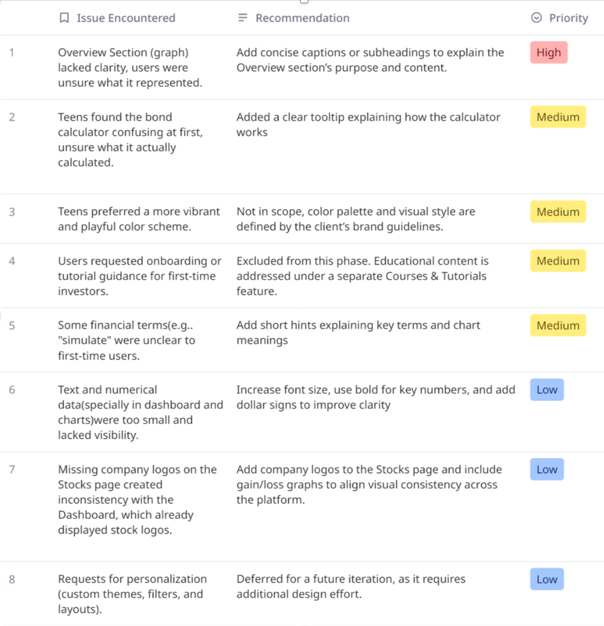
“Usability Test Findings Table summarizing key issues, recommendations, and their priority.”
These findings helped our team refine clarity, adjust hierarchy and labeling, and identify future opportunities such as onboarding guidance and more personalized visuals.
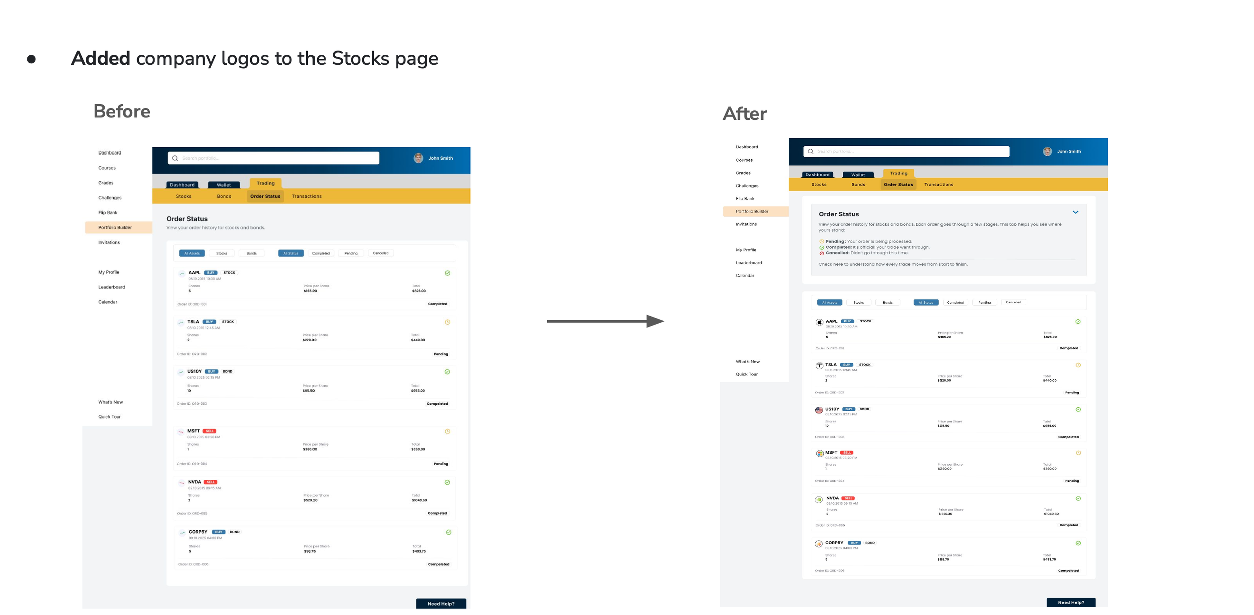
Iterations After Testing
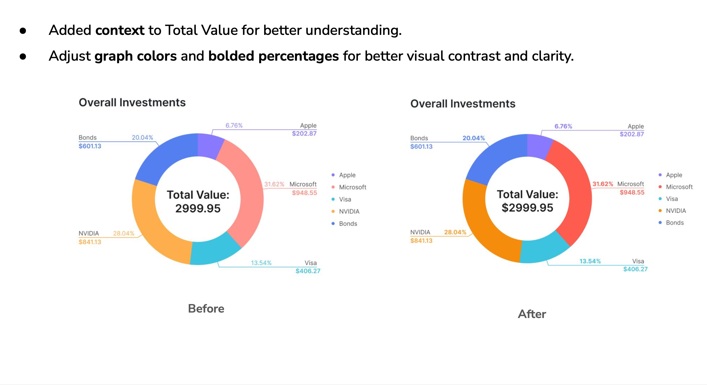
Based on usability feedback, we made several improvements to increase clarity and confidence for teen investors.
Conclusion & Reflection
This project was a good reminder of how much clarity and teamwork matter in the design process. I learned how to stay flexible, make smart decisions based on research, and keep the experience simple for teens who are just starting to learn about investing. Even though we shifted away from the Entrepreneur path, the work I did early on helped us understand the bigger picture and choose the right direction for the MVP.
Using the prototype for usability testing also taught me a lot about how teens think. They pay attention to visuals, get overwhelmed easily, and feel more confident when things look clear and friendly. Seeing their reactions helped me understand what really supports them and where the design needed more simplicity.
What I Learned
• Narrowing the scope early makes the whole project stronger
• Sharing research in a clear way helps everyone align
• Working with a team teaches you how to communicate and support each other
• Testing the prototype showed me how small changes can make a big difference
• Designing for teens means keeping things simple, visual, and not intimidating
What’s Next
If I continue this project, I’d love to:
• Add a short onboarding flow to help new users feel more comfortable
• Give teens more personalization options
• Bring the Entrepreneur path back in a future phase
• Add more visual moments of “progress” that feel fun and motivating
Overall, this project helped me grow as a designer. I learned how to balance research, teamwork, and positive user experiences and how to create something that feels helpful, friendly, and easy to understand.
