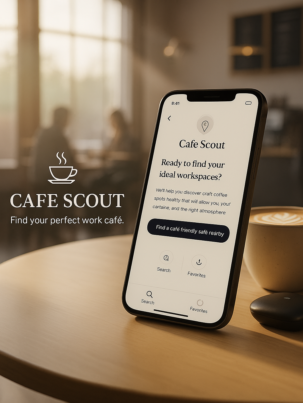
A mobile app that helps remote workers find the perfect café with reliable Wi-Fi, good seating, and the right atmosphere for work.
Project Highlights
Project: Cafe Scout ,Work Friendly Cafe Finder
Context: 5 Day Design Sprint
Timeline: 1 week (2025)
My Role: UX / UI Designer , end to end
Tools: Figma, Miro, Google Docs
Overview
A mobile app that helps remote workers find the perfect café with reliable Wi-Fi, good seating, and the right atmosphere for work.
Cafe Scout is a simple mobile concept designed during a 5 day design sprint. The goal was to help remote workers quickly answer one question: “Is this café a good place to work right now?”
The project focuses on surfacing the details people care about most Wi-Fi, seating, atmosphere, call friendliness, outlets, and parking so they can make a decision in under a minute.
Problem & Why It Matters
Remote workers often need a quick spot to take a call or get focused work done, but most apps don’t answer the real questions:
Is it too loud? Is the Wi-Fi strong? Will I find a seat? Can I even park?
People jump between Google Maps, Yelp, and reviews trying to piece together this information, and it still feels like guesswork,especially when they’re in a rush or between meetings.
For this sprint, I focused on a single, practical problem:
Remote workers can’t easily tell if a cafe is work friendly right now.
Why this matters
A bad cafe choice can waste time, break a meeting, or force someone to relocate. Remote workers told me they care less about ratings and more about conditions things apps don’t make obvious.
They want a fast, confident answer, not 20 minutes of searching.
The challenge
My challenge was to make something as unpredictable as “work friendly atmosphere” feel clear and quick to judge. I needed a simple way to show Wi-Fi, seating, noise, and call friendliness without overwhelming the user or making them read long reviews.
The Solution
I designed a simple mobile flow that helps remote workers decide, in under a minute, whether a cafe is the right spot for work. Instead of making users dig through long reviews, Cafe Scout surfaces the things they actually care about: strong Wi-Fi, open seating, reasonable noise, a good atmosphere for calls, and easy parking.
The core idea was to keep everything calm and quick. A clean map view helps people scan nearby options fast, and each cafe has clear work friendly badges so they can make a confident choice without bouncing between apps.
The main screens focus on three moments:
finding cafes nearby
checking work friendly details
getting directions and heading out
Everything stays lightweight, visual, and practical,exactly what a busy remote worker needs when they only have a few minutes between meetings.
Process
This project followed a fast 5 day design sprint. I used the first three days to understand how remote workers actually choose a café today, explore different layout ideas, and lock in a simple flow before moving into high fidelity screens.
Understanding the current journey (Day 1)
On Day 1, I focused on what remote workers already do when they try to find a place to work. I defined a simple user and goal:
User: Remote worker who needs a call friendly place with strong Wi-Fi, outlets, seating, and parking.
Goal: Work productively for 2–3 hours at a nearby cafe that allows calls and feels practical, not stressful.
I mapped the current journey step by step from the moment they search “coffee shops near me” to checking photos, popular times, amenities, and finally deciding where to go. This helped me see where time is wasted and what really matters in that decision.
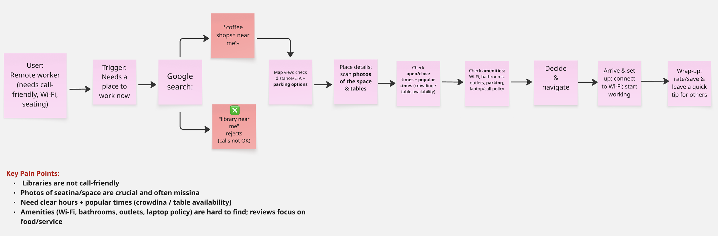
“I mapped the current journey from searching on Google Maps to arriving at the café. This made the pain points and “moments that matter” very clear.”
Moments that matter
Seeing real photos of tables and layout
Quickly checking distance/ETA on a map
Open/close times and Popular Times for the exact window they care about
Work specific details at a glance: Wi-Fi, outlets, bathrooms, parking, call/laptop policy
Key pain points
Libraries aren’t good for phone/video calls
Most sites talk about food and service, not work needs
Wi-Fi, outlets, parking, and laptop/call rules are hidden deep in reviews
It’s hard to guess how crowded a café will be at a specific time
These insights shaped the entire concept for Cafe Scout: the app should answer “Can I actually work here right now?” in a few seconds, without jumping between different apps.
Exploring Ideas (Day 2)
On Day 2, I switched into exploration mode. I looked at existing apps to understand what already works, then sketched different ways to show work friendly details without overwhelming the user. This helped me find a direction that feels simple and fast for busy remote workers.
Lightning Demos — Inspiration from real apps
I analyzed a few apps that remote workers already rely on mainly Google Maps, Yelp, and Croissant.
Each one had something useful:
Google Maps showed crowd levels and helpful photos
Yelp listed Wi-Fi, parking, and other features
Croissant used a clean, simple layout for quick decisions
These patterns made me focus on clear badges, reliable photos, and a clean structure for the Café Details screen.
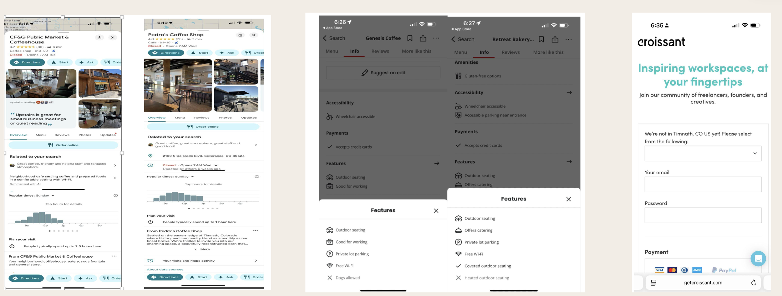
“ These apps helped me understand how people scan crowd levels, amenities, and photos when choosing a café.
I used these patterns to guide the design of Café Scout.”
Crazy 8s — Exploring Layout Ideas
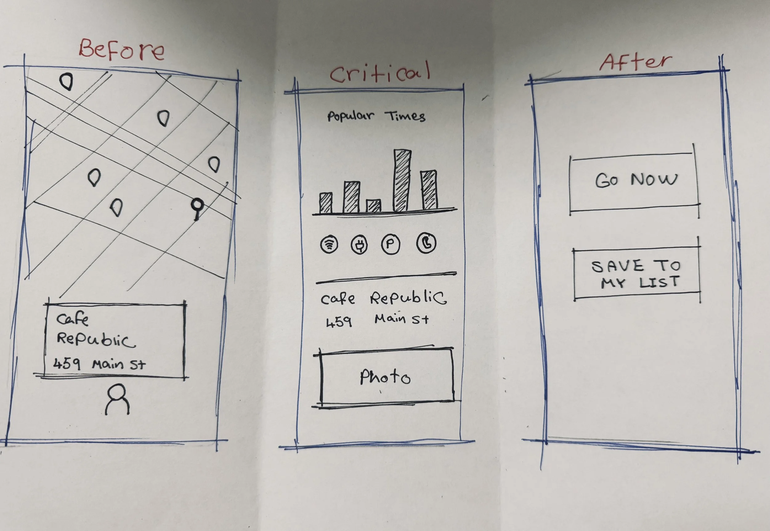
After looking at existing apps, I wanted to push myself to think quickly and explore different ways to show work-friendly information. I used a Crazy 8s exercise to sketch eight fast layout concepts for the Cafe Details screen. These sketches weren’t meant to be perfect ,they helped me try different placements for Popular Times, badges, and photos to see what felt the easiest to scan.
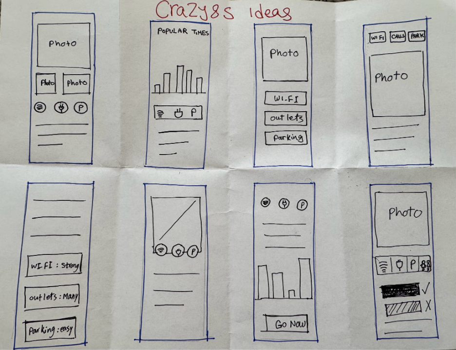
“ Day 2 – Crazy 8s helped me explore different layouts quickly and stay open to new ideas.”
Filtered Results — Updated list
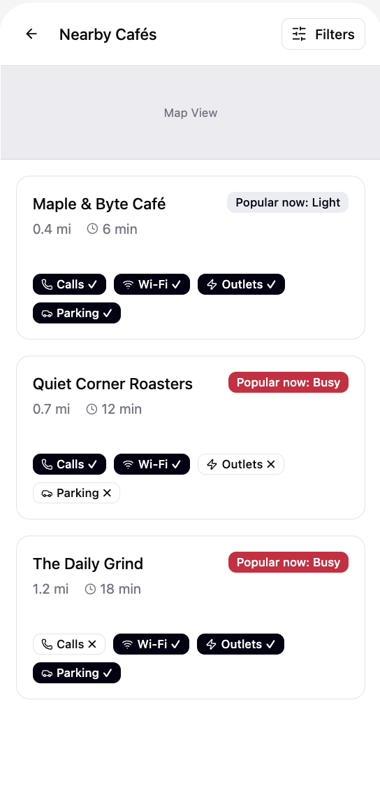
After applying filters, the list updates instantly and shows cafés that fully match the user’s work requirements.

“Day 4 – Refined results with real time update.”
Cafe Details — Make the decision
This is the core decision screen. I placed Popular Times at the top and included clear badges for calls, Wi-Fi, outlets, and parking. A short note about noise and seating helps users make a quick, confident judgment.
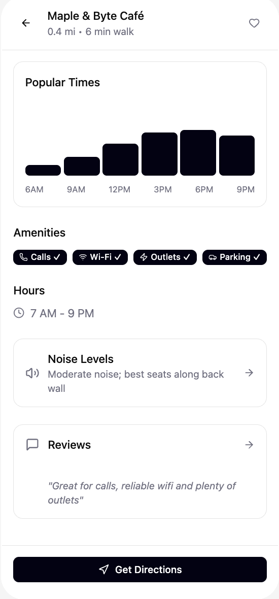
“ Day 4 – Popular Times + work friendly badges help users decide in seconds.”
Directions — Final step
When a user picks a cafe, the final step is simple: open in Maps and go. I kept this screen quiet and clear so it doesn’t interrupt the flow.
I kept the prototype focused on the happy path so it felt real without adding unnecessary screens. Using believable details like realistic distances and Popular Times helped participants react naturally during testing.
Prototype
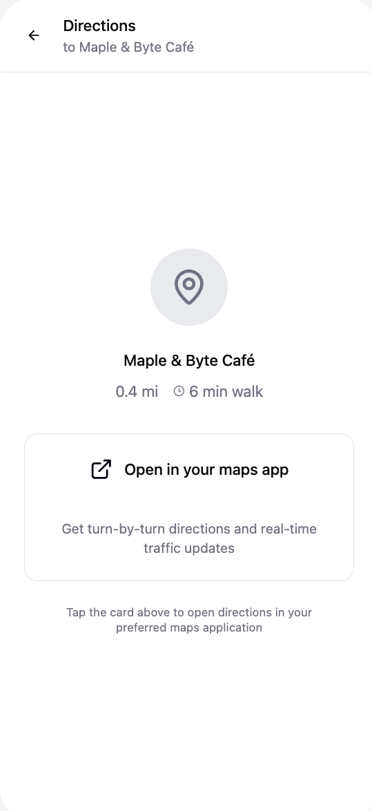
“ Day 4 – Easy handoff to navigation.”
Before testing on Day 5, I created a simple high fidelity prototype that walks through the full experience: finding nearby cafés, applying work friendly filters, reviewing key details, and getting directions. The goal was to make the flow feel calm, fast, and honest so users could react naturally during testing.
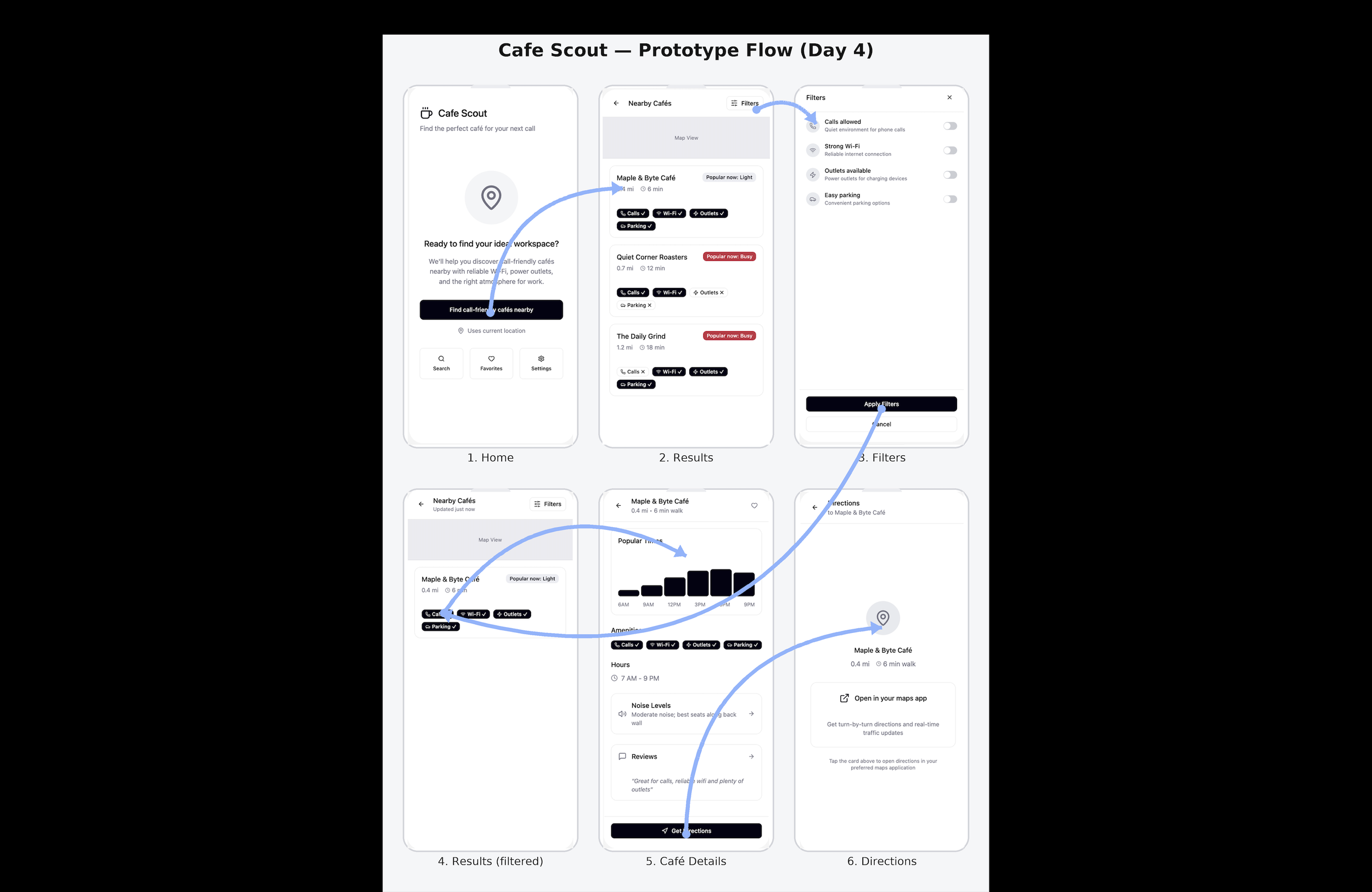
“ Day 4 – High-fidelity prototype showing the full flow:
start a search → compare cafés → apply filters → check details → get directions.”
Usability Testing (Day 5)
I ran a quick pilot test with five remote workers to see how fast they could choose a cafe and whether the decision screen made sense.
What I learned
Most people picked a cafe in about 1 minute.
Filters were helpful but not instantly noticeable.
The “Calls” badge confused a few users.
“Popular now” needed a little more explanation.
Everyone liked the quick noise + seating note.
A few things users said
“Does ‘Calls’ mean I can take calls here?”
“I found the filters… just took me a second.”
“Love the seating tip.”
Takeaway
The flow works well overall, but a few labels and steps can be clearer.
That’s it. Short, simple, and perfect for a mini project.
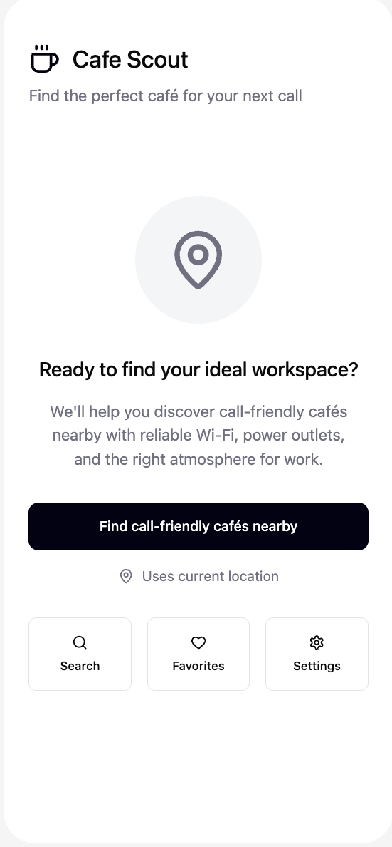
“ Day 4 – Clear CTA to start the task quickly.”
“ Day 4 – Quick list of nearby cafes with work friendly badges and “Popular now” status. ”
Solution Sketch — Choosing the Direction
From the Crazy 8s exercise, I chose the layout that felt the clearest for a fast decision: Popular Times on top, followed by the core work friendly badges (Calls, Wi-Fi, Outlets, Parking). I turned this into a simple three panel sketch showing the flow from finding a cafe → checking details → taking the next step.
This sketch became the foundation for the prototype.
On Day 3, I reviewed everything from Day 1 and Day 2 and chose the flow that helped remote workers make the quickest, most confident decision. I compared a few different approaches, but the flow that put the Cafe Details screen at the center made the most sense because it answers the question “Can I work here right now?” in just a few seconds.
Storyboard
Day 2 – My final solution sketch set the direction for the prototype and made the decision screen feel simple and fast to scan.
Finalizing the Flow (Day 3)
To stay focused, I created a simple 10–12 panel storyboard showing the main journey from opening the app to choosing a café and getting directions. Each panel highlights only the pieces needed for the core experience:
Opening the app
Seeing nearby cafes
Applying work friendly filters
Checking Popular Times and badges
Confirming call friendliness
Getting directions
This storyboard helped me keep the prototype light, clear, and easy to test.
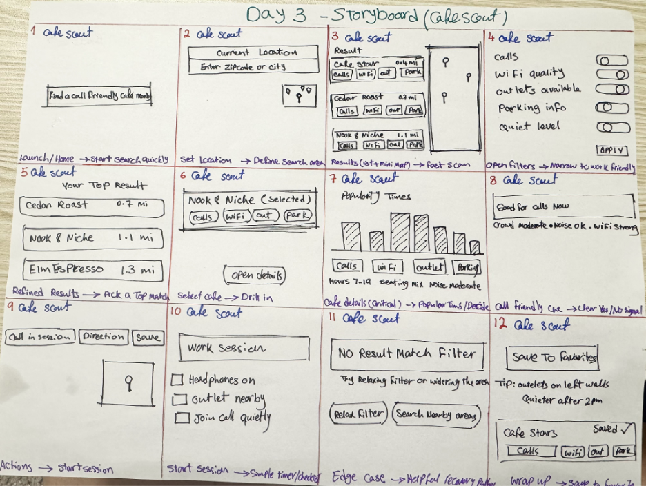
Day 3 – The storyboard clarified the full experience and helped me focus the prototype around the moment of decision.
Prototype — Key Screens (Day 4)
On Day 4, I moved into high fidelity designs and built a simple clickable prototype. I focused only on the essential screens needed to complete the main task: find a call friendly cafe, check work friendly details, and get directions. Keeping the flow light made the prototype fast to test and easy for users to understand.
Home — Start the task
The home screen gives users a clear, simple starting point. With one tap, they can begin searching for call-friendly cafes near them.
Nearby Cafes — Quick comparison
he results page shows nearby cafes with the most important details: distance, ETA, and work friendly badges. Users can quickly compare options without opening full pages.
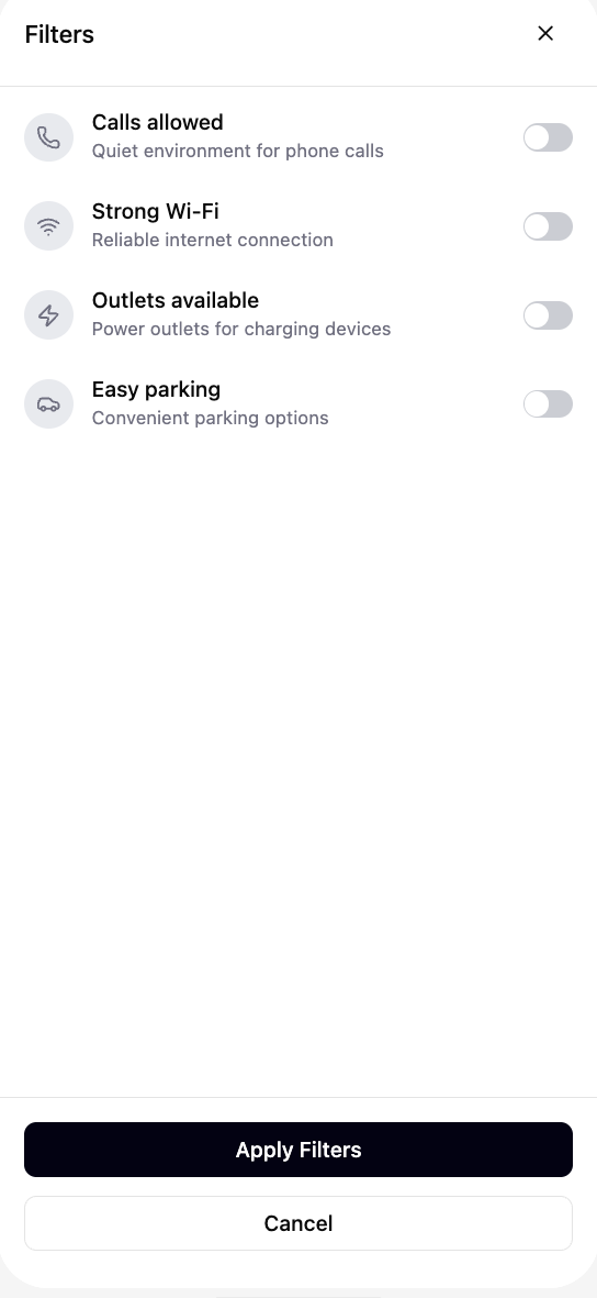
Filters — Set work needs
Users can refine results based on what matters to them: calls allowed, strong Wi-Fi, outlets, and parking. The toggles keep the filtering experience light and fast.
“ Day 4 – Simple toggles to support different work needs.”
Improvements
&
Next Steps
Based on testing, a few small updates would make the flow clearer:
Rename “Calls” to “Calls allowed”
Add a tiny tooltip explaining “Popular now”
Make the Filters button more noticeable
Add Open in Maps directly on the Cafe Details screen
Next steps
If I continued this project, I’d test these updates with more remote workers and explore how real time data (crowding, noise, seating availability) could improve the experience.
Outcome
This 5 day sprint helped me turn a simple idea into a clear, testable experience. Remote workers were able to choose a café quickly, and the feedback showed exactly where small refinements could make the flow even clearer especially around labels, filters, and the final step to directions.
If continued, the next phase would focus on testing the updated labels, exploring real time data options, and refining the decision screen even further.
Overall, this sprint reminded me how much a calm, simple flow can help people make confident decisions when they’re in a rush.